


Rohrer and Klingner make wonderful inks – I've enjoyed Morinda, a vibrant, juicy candy-red, and Verdigris, a dark, weathered blue-green. I also really liked Scabiosa, a dusky purple, and one of the only non-blue-black iron gall inks that I've ever seen. Salix is R&K's other iron gall ink, and it, too, defies the traditional iron-gall color scheme, though not as significantly as Scabiosa.
Salix goes down on paper a bright oceanic blue and then darkens as it dries. In wet nibs, it turns a deep midnight blue, and exhibits moderate shading, whereas in dry nibs, it takes on a powdery look and delivers a consistent line. As it ages, it takes on more of the traditional blue-black iron-gall character, but remains primarily blue.
For those unfamiliar with iron gall, it was the most common form of ink used in Europe from the 12th through the 19th centuries. When used on vellum or paper, it cannot be removed by rubbing or washing – only be scraping away a layer of the writing surface.
Traditional iron gall ink has one very specific caveat. It is produced by combining iron salts with tannic acid extracted from various vegetable sources (traditionally from oak galls, which are hard, brown spheres that grow on oak trees and house wasp larvae – for real – nature is weird), which means that it is not pH neutral. Over time, the acidic nature of the ink will gradually eat away at vellum and paper, and could contribute to the corrosion of any steel components on a fountain pen.
Fortunately, modern formulations of iron gall ink are safe for fountain pens. The levels of acid are low and should not be a cause for concern for most users.
Salix behaves reasonably on each of the papers I tested. Its drying time is significantly longer than its cousin, Scabiosa, but is not unreasonable. Dry time on fountain-pen-friendly Clairfontaine paper took about twenty seconds. On Staples bagasse, it was dry to the touch in ten seconds, and on cheap copier paper, it dried in five. Feathering was extremely low on each of the previously mentioned papers, as were show-though and bleed-through.
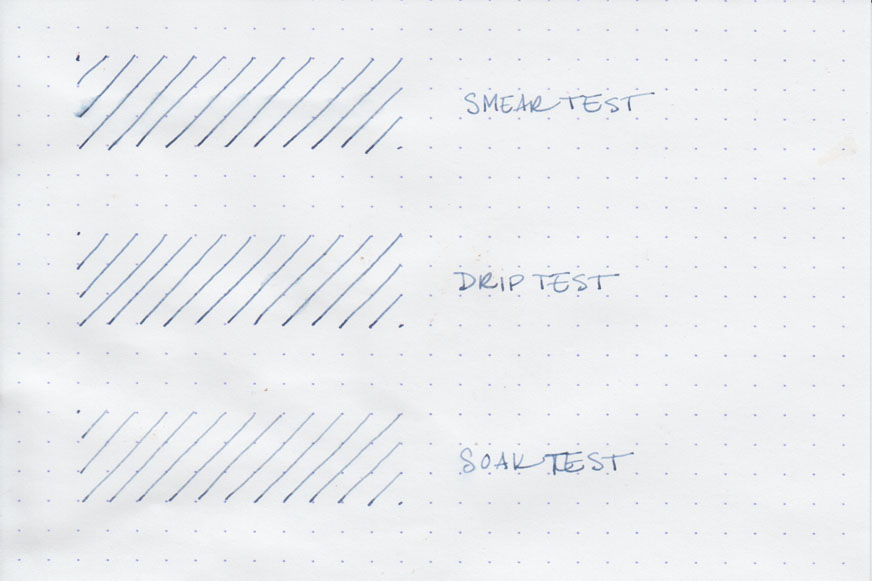
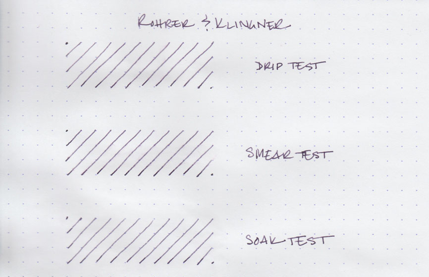
As befits iron-gall ink, Salix performed well on the various water tests I subjected it to. However, like most permanent dye-based inks, (and unlike Platinum Carbon and other pigmented inks) only the ink that bonds to the paper can be considered waterproof. In the smear test, in which I drag a wet finger across the surface of the paper, you can see a light smudge caused by a small amount of ink that dried on top of the surface of the paper.
The drip test, in which I let droplets of water soak on the page before blotting them up, reveals a slight bit of feathering due to the surface ink running and then drying elsewhere on the page. The original lines are still completely readable.
The soak test, in which I run the paper under a stream of water for half a minute, results in the surface ink washing cleanly away, and leaving fully legible, though slightly lighter, lines behind.

Rohrer and Klingner inks come in a 50ml glass bottle with a screw-on, metal lid. The color featured on the label in intended to mimic the color of the ink within. They're neither unattractive nor exceptionally pretty; instead they're merely functional, and remind me of art supplies. Unless you're an artist, they're not the kind of bottle you're likely to feature in a prominent place on your desk.
If you're in the mood for permanent fountain pen ink that behaves well and delivers a lovely blue color, then you can't go wrong with Rohrer and Klingner Salix. It's work-appropriate, waterproof, and moderately priced, to boot. I highly recommend it.
Rohrer and Klingner Salix is available from:
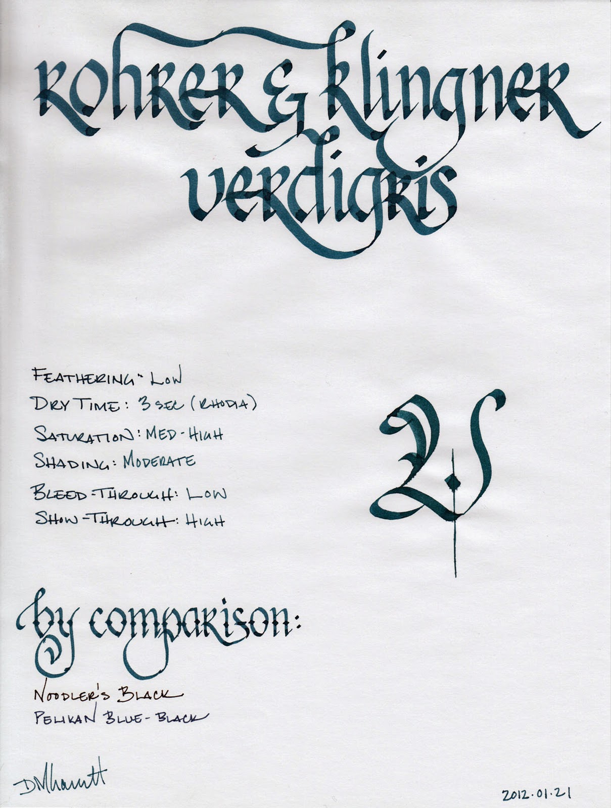
Review notes: The widest lines were made with two Pilot Parallel calligraphy pens: one with a steel 6.0mm nib and the other with a steel 3.8mm nib. The medium lines were made with a Lamy Joy Safari with a 1.9mm steel calligraphy nib. The narrow lines were created with a TWSBI Diamond 540 with a steel EF nib. The paper is Rhodia 80 gsm from a Rhodia Bloc No. 18. The featured script is Fractur.