ink

Inkventory: 2015

image.jpg

 Three years ago, I took stock of my ever-expanding ink collection. It feels like it's time to tackle that process again. Here is the full list of ink bottles that I own, most of which are pictured above:

De Atrementis

Diamine

Everflo

J. Herbin

J. Herbin 1670

Kaweco

  • Caramel Brown
  • Midnight Blue
  • Palm Green
  • Paradise Blue
  • Pearl Black
  • Royal Blue
  • Ruby Red
  • Summer Purple

Lamy

Noodler's

Parker

Pelikan

Pelikan Edelstein

Pilot Iroshizuku

Platinum Pigmented

Private Reserve

  • Chocolate
  • Orange Crush

Roher & Klingner

Sailor

Waterman

  • Florida (Serenity) Blue
  • Purple

ink review: noodler's liberty's elysium

(click to embiggen)

There are many good things to say bout the Goulet Pen Company, but one of them is the degree of care they take in packaging items for shipment. Most bottles of ink are individually wrapped to insure against leakage, then are wrapped in several layers of bubble wrap to prevent them from getting banged around, and then again in plastic wrap to protect them against the elements. As you might expect, I've never had any item arrive in a damaged state, despite packages being left in the rain, left in the snow, and left in the rain/snow combination whimsically referred to as a "wintery mix."

Beyond the care taken, though, the most distinctive thing about a shipment from the Goulet Pen Company is the bright, blue packaging material. If you've ordered from them before, you'll know exactly what I'm talking about. They also use a very similar blue in their ink drop logo. So when the newest Goulet-exclusive ink was announced, many people speculated that we'd see something in "Goulet blue."

Liberty's Elysium, manufactured by Noodler's Inks, is exactly that lovely, cool shade of blue. It is vibrant enough to provide great contrast on white paper, but subdued enough to be easy to read. It is brighter than Waterman Florida Blue, but not nearly as obnoxious as Noodler's Baystate Blue. Like most Noodler's inks, Liberty's Elysium is highly saturated and produces a bold line with a low level of shading.

It is wet writing ink that dries very quickly. Show-through was moderate on each of the paper types I tested: fountain pen-friendly Rhodia, Staples bagasse notepads, and cheap, office-quality copier paper. In my Clairefontaine notebooks, I was able to use both sides of the paper without any issues.

Bleed-though was likewise very good, except where I was using wet-writing calligraphy pens. Even then, it only occurred where the ink pooled on the paper at the bottoms of letters.

Noodler's Liberty's Elysium caused a moderate amount of feathering in wet writing pens and on cheap paper. This is evident in the "by comparison" section of the written review, were the "b" and "r" both suffer from severe feathering. On office-grade copier paper, and on Staples bagasse, it produced a medium line instead of a fine line. Generally, though, the feathering is tolerable – on good quality, ink resistant paper the behavior is almost non-existent.

Yet, despite how wet the ink is, my single criticism of Liberty's Elysium is that is dries too quickly. Those who have read my other reviews may find this ironic, as long dry times have been my chief complaint about other Noodler's inks. However, when using my Visconti Homo Sapiens, leaving the cap off for more than five seconds causes the pen to start hard and occasionally skip on the initial stroke. Drying quickly on paper is an admirable quality. Drying quickly in my pen is less so.

Regardless, on Rhodia paper, Liberty's Elysium dried to the touch in about 5 seconds. On Staples bagasse, it took about 10 seconds, but on office-grade copier paper, it was dry in less than three seconds.

Liberty's Elysium was originally marketed as bulletproof ink, which caused some controversy when it was released. The term "bulletproof" isn't a regulated term, nor is it a commonly accepted industry term. It is a marketing term coined by Nathan Tardiff, the man behind Noodler's Inks, but it is one that has been applied consistently across the Noodler's line. The fountain pen community has come to expect a specific set of behavior from these inks.

Noodler's bulletproof inks are designed to withstand attempts to remove them from paper. The dyes bond to the cellulose in the paper and can't be washed away by water, bleach, or other methods. Therefore, they stand up fairly well to water on most paper. On coated papers that resist ink, they may sometimes smudge, as the ink that dries upon the surface is still susceptible to being washed away, but the color and intensity of the ink remain stable.

(click to embiggen)

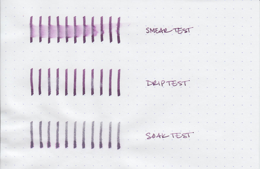
The water test reveals the trouble with marketing Liberty's Elysium as bulletproof. The smear test, in which I run a wet finger across the page, results in a blue smudge and significant travel of the ink across the page. The lines are still intelligible, but they are significantly diminished in intensity.

The drip test, in which I let several drops of water sit on the page before blotting them up, results in similar behavior: ink that bleeds and smudges, and is reduced in intensity. The soak test, in which I run the paper under a stream of water for thirty seconds, results in a significant portion of the ink being washed away and some feathering. This is not the behavior that most Noodler's customers have come to expect from their bulletproof ink.

However, a closer look at the soak test reveals that the lines that remain are completely legible and fairly bold. It appears that the ink is partially bulletproof – some portion of the ink remains resistant to removal while the rest can be washed away. This is similar in behavior to Noodler's Black Swan in Australian Roses, which is marketed as "partially bulletproof." Consequently, Noodler's Ink and Goulet Pens have changed the designation of the ink to match, which, in my opinion, nicely solves the problem.

Nathan Tardiff is a man who enjoys the study of history. Many of his inks have historic elements in both name and label design. It's the most common motif beyond the Noodler's catfish mascot. With a name like Liberty's Elysium, one would expect a historically themed label, and Mr. Tardiff does not disappoint. The label is packed with scenes from the American colonial period, including Patrick Henry's quote, "Give me liberty, or give me death!" Brian Goulet explains the meaning behind the other scenes and quotes on the label in the video where he introduces the ink.

It is fair to say that the labels bring an interesting touch to an otherwise utilitarian bottle. Aside from some specialty lines, Noodler's inks are packaged in plain, 3 oz, glass bottles that are sourced from high-volume suppliers in order to keep costs down. You could easily see these bottles filled with spices in your local grocery store. The bottles are notoriously filled to the brim, so be careful when opening – make sure you've got it somewhere flat and stable before you unscrew the cap.

Liberty's Elysium is great ink worthy of the great people who work at Goulet Pens. It's a beautiful blue that's just subdued enough for the office, but still interesting enough for personal use. It behaves moderately well on a wide variety of paper types, and it is one of the few blue (not blue-black) inks with this level of permanence. My only quibble is the behavior of the ink in my Visconti pen – drying too quickly in the nib. Beyond that though, the Goulets should be proud of their newest exclusive ink.

Review notes: the wide strokes were made using a Pilot Parallel calligraphy pen with a 3.8mm steel nib. The medium strokes were made with a Pelikan Script 2.0 pen with a 2.0mm steel nib. The fine lines were made using a Visconti Homo Sapiens pen with an EF palladium nib. The paper is Rhodia 80gsm from Rhodia Bloc pads.

Noodler's Liberty's Elysium is available exclusively from:


fountain pens for beginners

When someone gets bitten with the fountain pen bug, they often become overwhelmed by all of the available choices, and then quickly ask a number of questions: What is the difference between a cartridge, a converter, a piston, and a vacuum fill? What's the difference between a steel and gold nib? Who makes the best ink? What kind of paper do I need? What's more, where do I get all of this stuff?

It is easy to get overwhelmed, so here are my suggestions for where to start. These are good, solid products that are easy to use and represent great value for the money. Once you've got the hang of the basics, you can explore the more advanced options – but you'll still want to hold on to the items that I describe below.

The three main factors that will affect your experience are the pen itself, the ink, and the paper.

Pen

(Lamy Safari in charcoal)

The best beginner's pen, in my opinion, is the Lamy Safari. The Safari is a workhorse of a pen and is marketed toward every-day users and students. It is easy to clean and maintain, it's durable, and it's fairly priced. The steel nib is available in a variety of widths, which range from extra-fine, which approximates a fine-tipped ballpoint pen, to fine, which resembles a medium-tipped ballpoint pen, to medium and broad. The plastic body of the pen comes in a range of colors, from conservative charcoal to bright red.

The Safari comes with a cartridge of blue ink. The cartridge plugs into the back of the nib unit, and can be replaced with other cartridges. Lamy ink cartridges come in basic colors: blue, black, blue/black, red, green, turquoise, and violet. They are easy to use, convenient to carry around, and are fairly mess free. The only drawback is the lack of color variety.

(Safari nib unit with converter attached)

If you feel like exploring the wide range of colors available in bottled inks, then you'll need something called a converter. A converter plugs into the back of the nib unit, just like a cartridge, except that it contains a screw-driven piston. To fill a pen that uses a converter, you'll need to plunge the whole nib, up to the barrel of the pen, into an open bottle. By twisting the screw on the end of the converter, you can move the piston up and down, and pull the ink up into the barrel.

When you've filled the converter, make sure to wipe off any excess ink on the body of the pen and the nib with a paper towel. Otherwise, you're liable to end up with inky fingers.

Ink

(From the left: Noodler's Black, Waterman Florida Blue, Diamine Monaco Red)

Bottled fountain pen ink is available in a wide variety of colors and qualities. Some ink is highly saturated and produces vibrant, solid lines. Other ink produces amazing variations in shading, resulting in a lovely watercolor effect with each stroke. Some ink is designed to withstand the attacks of forgers and resist all attempts at removal, while other ink is designed to wash right out of clothing.

One of the joys of owning a fountain pen is exploring all of the amazing options. Fortunately, there is a large community of individuals who post their impressions online, along with color swatches, writing samples, and artwork.  Many are even willing to trade ink samples through the mail. It's easy to get addicted.

To start, though, you're going to want the basics:

Noodler's Black is one of the all-time great inks. If you like black ink, and you write primarily on copier paper, legal pads, or other office-grade paper, then you'll love the solid line it produces, the way that it makes the pen feel like it's gliding across the surface of the paper, and the lack of feathering it exhibits. Its main drawback is that, on high-quality, coated papers, it can take a really long time to dry – upwards of minutes. It also has the benefit of being resistant to water and to forger's tricks. It's a great ink to sign checks and contracts, or to address envelopes with.

Waterman Serenity Blue (formerly known as Florida Blue) is one of the classic blue inks. It is vibrant enough to read easily but conservative enough for business use. It behaves well on even cheap paper, and it cleans up easily from both pen and skin.

If you do any sort of editing, underlining, or highlighting, then a vibrant color is useful to have in your collection. Diamine makes ink that has a great balance of properties: their colors are vibrant, they dry in a reasonable time frame, and they behave well across a variety of paper types. Their Monaco Red is an earthy, orange red with brick undertones that shows up easily on the paper without being obnoxious and hard to read.

Paper

The last piece of the puzzle is paper. Most people are familiar primarily with notebook paper, legal pads, and cheap, office-grade copier paper. A whole world of high-quality paper awaits. Two brands of paper are well knows for being fountain-pen friendly. They have smooth surfaces, which makes them easy to write on, and they resist ink, which means that they produce nice, crisp lines with a minimum of feathering.

(Rhodia notepads)

Rhodia is famous for producing notepads bound in a bright orange, coated cardboard. They are available in a wide variety of sizes and in blank, lined, or graph paper. The microperforated paper itself is bright white and pH neutral, so it is easy to read, stands up to wear and tear, and lasts a long time. Rhodia notepads are what I use to write all of my ink reviews.

Clairefontaine makes great notebooks. Their softcover, clothbound notebooks contain 96 pages of satin-smooth, bright white paper, and are available in blank, lined, French-ruled, or graph.

All of the items mentioned above can be found online at various retailers. My preferred source is Goulet Pens, which is run by a husband and wife team who are very active in the fountain pen community. They're friendly people, their customer service and shipping times are outstanding, and they've always got great prices on their products. They're where I buy the majority of my pens, ink, and paper.

If you want to know more about fountain pens, ink, and paper, I would encourage you to check out the Fountain Pen Network – a forum for pen enthusiasts and a repository of huge amounts of information. Also make sure to check out any of the ink links (which you can find to the right), which are pen-related blogs that I read on a regular basis.

You're also welcome to ask me questions, either by email or here at Seize the Dave.

Happy writing!

ink review: de atramentis aubergine

(click to embiggen)

De Atramentis Aubergine is a wonderful, juicy purple that is more red than Diamine Imperial Purple, but less so than Iroshizuku Yama Budo. It's one of those inks that possess a name that's far more evocative than anything I could come up with. They weren't kidding when they named it Aubergine. The color fits nicely into the purple family – filling a gap in my ink collection that I didn't even know existed.

Aubergine is highly saturated and creates moderate shading in a wet nib. It is also very wet ink – on the level of J. Herbin or Iroshizuku. It flowed easily from the nib, setting the pen gliding across any of the papers on which I tested it. While it performed well on fountain-pen friendly Rhodia pads and Clairefontaine notebooks, it did exhibit moderate feathering and noticeable bleed-through on absorbent paper types.

On Rhodia paper, Aubergine dried in fifteen seconds, displayed no feathering, and had only moderate show-through when used with the EF nib in my Visconti Homo Sapiens. It did bleed through in the large-nib calligraphy pens – and you can even see significant feathering where the ink pooled in the "a" in "Atramentis."

On Staples bagasse, it dried in five seconds, trading quick dry time for moderate feathering and show-through, and minor bleed-through. On cheap, recycled copier paper, it dried in 3 seconds and exhibited the same level of feathering, show-though, and bleed-through. I'd say it behaves reasonably when used with a fine nib, though caution should be used with a broad or other wet-writing nib.


(click to embiggen)

Pleasantly, the water tests revealed an unexpected level of water resistance. The smear test, in which I run a wet finger across the page, resulted in a vibrant purple smear, but left the lines still legible.

The drip test, in which I let drops of water sit on the page before blotting them, resulted in some ink being lifted and moderate feathering. However, it left the lines on the page intact. The soak test, in which I run the paper under a stream of water for half a minute, had the most surprising result: the water lightened the lines, but left them completely legible. I had no expectations of water resistance when I set out to test the ink, but I'm very pleased by what I found.


(click to embiggen)

De Atramentis inks come in 35ml glass bottles with plastic caps. The label on the bottles is semi-representative of the color of the ink contained within – Aubergine is fairly accurate, but I have heard that other colors are less so. The bottles themselves are functional and not unpleasant to look at, but don't rank among the sculptural achievements that contain Iroshizuku or Peklian Edelstein ink.

The vibrancy of Aubergine makes it ill suited to business use. While it is dark and saturated, it is quite clearly purple – and not a conservative purple like Diamine Damson or J. Herbin Poussiere de Lune. It is purple and there's no getting around it. For personal use, though, it's quite versatile – the color is luscious, but it's neither glaring nor obnoxious. It is easy to read and provides excellent contrast on bright white paper.

Aubergine is my first experience with De Atramentis ink, and I'm left with quite a positive impression. The quality of the color and the generally good behavior of the ink leave me wanting more. I'm excited to try out lots of the lovely colors that De Atramentis has available.

Review notes: To write the name of the ink, I used Pilot Parallel calligraphy pens with 3.8mm and 6.0mm steel nibs. A Lamy Joy calligraphy pen fitted with a 1.9mm steel nib created the medium-width lines. I used my Visconti Homo Sapiens with an EF palladium nib to create the fine lines on the page. The paper is bright white 80gsm from a Rhodia Bloc pad. The featured script is flourished italic.