noodler's

Ink Review: Noodler’s 54th Massachusetts

FullSizeRender.jpg

Noodler’s 54th Massachusetts blue-black ink has become one of my favorites. It is conservative enough to be useful in any situation -- business or personal -- but is still a lovely diversion from a standard blue or black. It flows easily -- it is wet, smooth, and easy to write with. It dries in a reasonable amount of time, and I find the color pleasant and easy to read. It also appears to have a touch of chartreuse to it that blue and black inks don’t typically possess.

It’s highly saturated with low amounts of shading, even in a broad calligraphy pen. In a fine nib, it sometimes exhibits a slightly chalky appearance. It’s also worth pointing out that it smells strongly of solvents. If you are particularly sensitive to odors, you may want to avoid it for that reason, but it has never bothered me.

My complaints, such as they are, are twofold: first, it does not behave in an outstanding fashion on cheap, absorbent paper -- though I typically have the luxury of writing on good paper. Second, it does create a noticeably bold line, due to its wet flow, which doesn’t work as well with my condensed style of writing. I have to write with a looser and larger style in order for my writing to be legible. It turns my EF nib into a M nib. However, it is otherwise such a joy to use that I put up with the inconvenience in order to use it. That says something about my appreciation for this ink.

Dry time is relatively quick, though, as one would expect, it takes longer to dry on smooth, sized paper like Rhodia and Midori (20 seconds) than on cheap copier paper (1 second). It does bleed through and feather heavily on copier paper, but otherwise behaves.

FullSizeRender.jpg

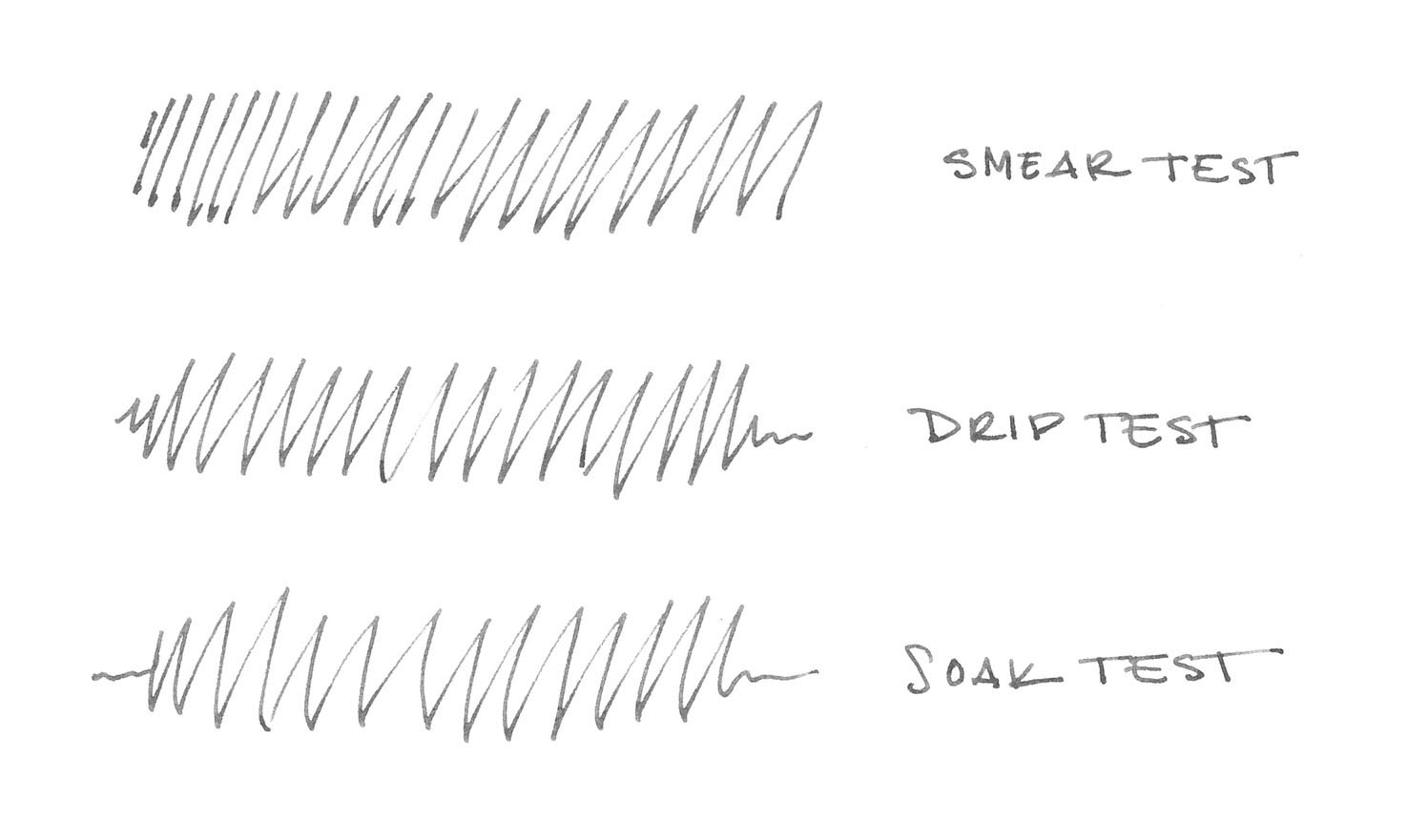
54th Massachusetts is advertised as bulletproof - a marketing term that Noodler’s created to refer to ink that can’t be removed once it has bonded to the fibers in the paper -- so one would expect it to hold up on the water test, and it does. 54th Massachusetts soaks right in to the paper, which means that, on the smear test, where I run a wet finger across the page, absolutely no ink moved.

On the drip test, where I place droplets of water on the page, absolutely no ink lifted off the page. Finally, on the soak test, in which I run the paper under the faucet, the ink stood resolute. Noodler’s 54th Massachusetts lives up to its bulletproof moniker - it's impossible to remove with water alone.

FullSizeRender.jpg

Noodler’s 54th Massachusetts comes in a standard 3 oz. Noodler’s bottle that’s filled to the brim – so be careful when opening. Noodler’s intentionally uses stock bottles and lids to keep their prices low, which means that they aren’t intended to be show pieces in and of themselves. The labels, however, almost always tell their own story.

Nathan Tardiff, the man behind Noodler’s, likes to create labels chock full of meaning. In this case, he chose an illustration of the ink’s namesake, the 54th Regiment Massachusetts Volunteer Infantry - the first African American regiment organized in the northern states during the Civil War. The regiment was organized in 1863 and, after training, was sent to South Carolina, where it took part in several famous battles, including the Second Battle of Fort Wagner.

The label illustrates the regiment's frontal assault on the fort - a charge that became one of the best known episodes of the war. It was the story of this regiment and their charge on Fort Wagner that was the subject of the film Glory.

All that aside, Noodler’s 54th Massachusetts is one of the best blue-black inks I’ve used. It’s a great value for the money, behaves generally well, and is easy to read. I highly recommend it.

Ink Review: Noodler's Ink Berning Red

Noodler's Berning Red

Noodler's Berning Red

It’s an immutable karmic law that, when an ink producer creates a new color specifically to mock a presidential candidate, one then must use said ink to write the candidate’s campaign slogan, regardless of how one actually feels about said candidate. In this case, Nathan Tardiff, the man behind the curtain of Noodler’s Ink, created Berning Red in honor of Bernie Sanders, the democratic socialist senator from Vermont, and one of the two remaining candidates for the Democratic nomination. The tagline for the ink is “a red for lefties that dries fast.” Because Sanders is a socialist, he’s a lefty on the American political spectrum, and left-handed writers need a quick drying ink - get it? Also red, because red is equated with socialism, as evidenced by the Soviet-propogada-inspired label.

Politics aside, Berning Red is quite a good ink. It’s a bright, candy-apple red - it doesn’t lean purple or brown, and no magenta is in sight. It’s a quintessential red that’s easy to read on the page. It has a moderate level of saturation, fading a little in the really broad strokes of a calligraphy pen, but producing a crisp, bold line with low levels of shading when used with a fine nib. It’s easy to write with, having a moderate level of flow and producing no sensation of scratchiness on most paper.

After I was done testing it, it cleaned up easily, flushing quickly from the converter and feed. It did not stain. Berning Red is also an extremely cost-effective ink. Noodler's standard line of ink is the best value on the market - the 3 oz bottles run roughly $12.50, which works out to a cost of $0.14 per milliliter - the lowest of any ink I’m aware of.

Paper Dry Time
Copier 1 second
Bagasse 5 seconds
Rhodia 5 seconds
Midori MD 15 seconds
Carson XL 10 seconds
Leuchtturm 10 seconds

So how does the quick-drying claim stand up? Well, it dries faster than a lot of Noodler’s ink, though not so quickly as I’d have imagined for an ink specifically designed to be fast-drying. Overall, it was dry to the touch and smudge free in less than 15 seconds, with cheap office-grade copier paper being the fastest and Midori MD paper the slowest of those I tested.

It is generally well-behaved across each of the paper types I tested, though it has an increased tendency to show-though on absorbent papers, and to bleed through when used with a really wet nib, like the Pilot Parallel pens. It’s not something you’re likely to encounter if you’re using good quality paper in a fine-nib pen, but it is something to keep in mind.

Noodler's Berning Red water test

Noodler's Berning Red water test

Berning Red held up surprisingly well in the water resistance test, in which I simulate three scenarios: something wet gets dragged across the page, droplets of water fall onto the page and get blotted up, and the paper gets soaked. It smeared easily enough when I ran a wet finger across the page, which resulted in a lovely red smudge - so it is not suitable for painting over with washes or watercolors. However, it didn't completely lift from the page when I blotted it, nor when I soaked it under the faucet, which means that your work won’t be completely obliterated if you do happen to get it wet by accident.

Noodler's Berning Red bottle

Noodler's Berning Red bottle

Noodler’s 3 oz glass bottles are, in and of themselves, utilitarian. They’re stock bottles ordered in bulk in order to keep the cost of production down. It’s the labels that are always interesting, even if they occasionally make you shake your head in bewilderment. Berning Red is certainly one of those cases. The Soviet-style design with hammer and sickle, and Bernie Sanders’ smiling face plastered on it is…fascinating. One cannot deny that it is eye catching. Whether you display the bottle proudly on top of your desk or stuff it in a drawer is likely to be driven more by your politics and sense of irony than by your aesthetic sensibilities.

Berning Red is a great ink. I’m very happy with having had the chance to test it. While it doesn’t displace Diamine Red Dragon as my current favorite red ink, its good behavior, ease of reading, and cost effectiveness make it a go-to choice when I’m in the mood for a vibrant red ink.

This bottle of Noodler’s Ink Berning Red was graciously provided by Pen Boutique.

Review notes: the handwritten portion of the review was created on 160 gsm, acid free, mixed media paper from Canson’s XL line. All lines, broad and thin, were made using a Pilot Parallel pen with a 3.8mm calligraphy nib. 

Ink Review: Noodler's Lexington Gray

Noodler's Lexington Gray

The USS Lexington is the oldest surviving aircraft carrier in the world. Commissioned in 1943, it saw extensive service as part of the Pacific fleet during WWII, where it developed a reputation for being impossible to sink - so much so that Japanese navy began referring to it as a “ghost” ship. This reputation, coupled with it’s blue camouflage scheme, earned the ship the moniker “The Blue Ghost.”

Since then, the Lexington has had a long career, acting first as an attack carrier, then as an anti-submarine carrier, and finally as a training carrier. It was finally decommissioned in 1991 and now lives as a museum ship in Corpus Christi, Texas, where it was designated a National Historic Landmark. If you’re going to pick a ship to name a waterproof, battleship gray ink after, the Lexington is a pretty great choice.

“Battleship gray" was named for the particular shade of gray paint used to rustproof steel battleships - a practice that began in the Royal Navy. The paint gets its color from micaceous iron oxide, a sparkly iron ore comprised of millions of tiny rustproof flakes. Curiously, the same iron oxide was first mined to produce “pounce" - the sandy power used during the 18th and 19th centuries to help quickly dry writing ink. Fortunately, you won’t need any pounce to deal with Lexington Gray, as it’s a very well-behaved ink.

It exhibits a surprising amount of shading for an ink with such a high degree of saturation. It’s not a high-shading ink, but there’s enough variation to make things interesting, even in a fine-nib pen. It’s easy to read on a variety of paper colors and types, from white to cream to yellow post-it notes.

It is smooth-writing ink, though the flow is slightly on the dry side. Overall, it’s easy to write with across most types of paper. It also behaves quite well on all of the paper types I tested. Feathering was low across the board, and dry times were will within expectations for the different paper types I tested: cheap, office copier paper; Staples bagasse notepad; Rhoda Bloc pad; Midori MD notebook; and Canson XL Mix Media notebook. 

Paper Dry Time Bleed Through Show Through Feathering
Copier 1 second Moderate Moderate Low
Bagasse 5 seconds Moderate High Moderate
Rhodia 10 seconds Low Moderate None
Midori 15 seconds None Low None
Canson 20 seconds None None None
Noodler's Lexington Gray water test

Noodler's Lexington Gray water test

Lexington Gray is advertised as "bulletproof" - Noodler's term of art for ink that resists removal from that paper, once dry. As you can see by the water test, the description is entirely accurate; the ink isn't going anywhere. Once again, the Lexington lives up to its reputation as unsinkable. This is one of the most impressive water tests I've done. If I didn't tell you that the scan above was from after the water test, you'd never suspect it.

I do three types of tests to evaluate an ink's water resistance. In this case, the first test was the smear test, in which I ran a wet finger across the page. The ink didn't budge. Second, I performed the drip test, in which I placed several droplets of water on the page and let them soak for a few seconds before blotting them up. The ink looked at me and laughed. Finally, I ran the paper under a stream of water for thirty seconds in a process that I call a soak test. The ink just shook its head and said, "Hey buddy. I ain't going nowhere, nohow."

One other item worth noting is that Lexington Gray is also advertised as UV light-proof. Testing ink for light-fastness isn’t part of my standard repertoire, but I do understand that it is a concern for those looking for an archival quality ink. If the water-fastness test is any indication of the ink’s light-fastness, though, I’m guessing that you could leave your work face up in the middle of the Sahara desert for several millennia, and it wouldn’t fade one bit. 

Noodler's Lexington Gray bottle

Noodler's Lexington Gray bottle

Noodler’s bottles are very utilitarian, and this one is no exception. The bottle of Lexington Gray is their standard, stock bottle, filled to the brim with ink. Be careful when opening a bottle of Noodler's ink for the first time - it's easy to spill if you're even the slightest bit careless. On the label is a picture of the ink's naval namesake, the USS Lexington. Noodler’s is never going to win design awards for their bottles or packaging, but they don’t need to when the ink itself is so good.

If you’re a fan of gray ink, or of bulletproof ink in general, Noodler’s Lexington Gray is well worth picking up. It’s a workhorse of an ink, and it will definitely become one of those that makes it into my regular rotation.

Noodler's Lexington Gray is available from many fine retailers, including:

Review notes: the handwritten portion of the review was created on 160 gsm, acid free, mixed media paper from Canson’s XL line. The broad lines were made using a Pilot Parallel pen with a 3.8mm calligraphy nib. The fine lines were made using a Visconti Homo Sapiens fitted with an EF palladium nib.