brown ink

Ink Review: Diamine Ancient Copper

Diamine Ancient Copper

Diamine Ancient Copper

Diamine Ancient Copper is one of an elite group of inks that seems to be universally respected. It is artistically interesting -- in broad nibs it shades dramatically. It is easy to read, providing sufficient contrast on white and cream colored paper without being hard on the eyes. It is also a very lovely color that one does not often see in ink formulated for fountain pens. Acrylics, oils, metallic markers, yes - but not fountain pen ink.

It also has gravitas of a sort that is not usually present in inks that are not black or blue - a sort of quality that makes one see it and think, “the person that uses this ink must be sophisticated." It’s similar in this way to Diamine’s Oxblood and Damson, red and purple inks that are equally substantive, and are good choices for those with needs that are more traditional, but who tire of black and blue.

In my experience, Diamine ink performs consistently across the different colors of the line: it feathers a bit on absorbent, un-sized paper, and it behaves admirably on coated, ink-resistant paper. Ancient Copper behaved as expected on the six paper types I used to test it: cheap, office copier paper; Staples Bagasse notepad; Rhodia Bloc pad; Midori MD notebook; Canson XL Mixed Media notebook; and Leuchtturm1917 notebook. It took anywhere between one second to dry on copier paper to twenty seconds to dry on Midori paper.

Diamine Ancient Copper Water Tests

Diamine Ancient Copper Water Tests

Diamine Ancient Copper is not a water resistant ink. It smudges and runs when exposed. In the smear test, in which I run a wet finger across the page, it left a coppery smudgy mess. In the drip test, in which I drip water and then blot it up, much of the ink lifted from the paper. In the soak test, in which I run the page under water, the ink nearly washed away completely. A ghost of the image remains - enough to still read it - but not much else.

Diamine Ancient Copper Bottle

Diamine Ancient Copper Bottle

Diamine ink is available in 30ml plastic and an 80ml glass bottles, both of which are utilitarian and slightly boring in appearance. The 30ml plastic bottle has a neck that is very small in diameter, and I found that some of my larger pens would not fit all the way in, which made getting to the ink a bit of a challenge. Though you may wish to go with the smaller volume to try out a new color, my recommendation would be to go for the larger bottle due to its superior usability.

Diamine ink is generally a very good value for the price -- similar to Noodler’s Ink. You get a lot for your money and the quality is very high, but one doesn’t buy it for the bottle. To me, Ancient Copper is a no brainer, in the same category as Noodler’s Black or Lamy Blue. It’s a classy, quality ink that looks good in almost every circumstance, behaves well, and is priced competitively.

Review notes: the handwritten portion of the review was created on 160 gsm, acid free, mixed media paper from Canson’s XL line. All lines, broad and thin, were made using a Pilot Parallel pen with a 3.8mm calligraphy nib.

Ink Review: Iroshizuku Tsukushi

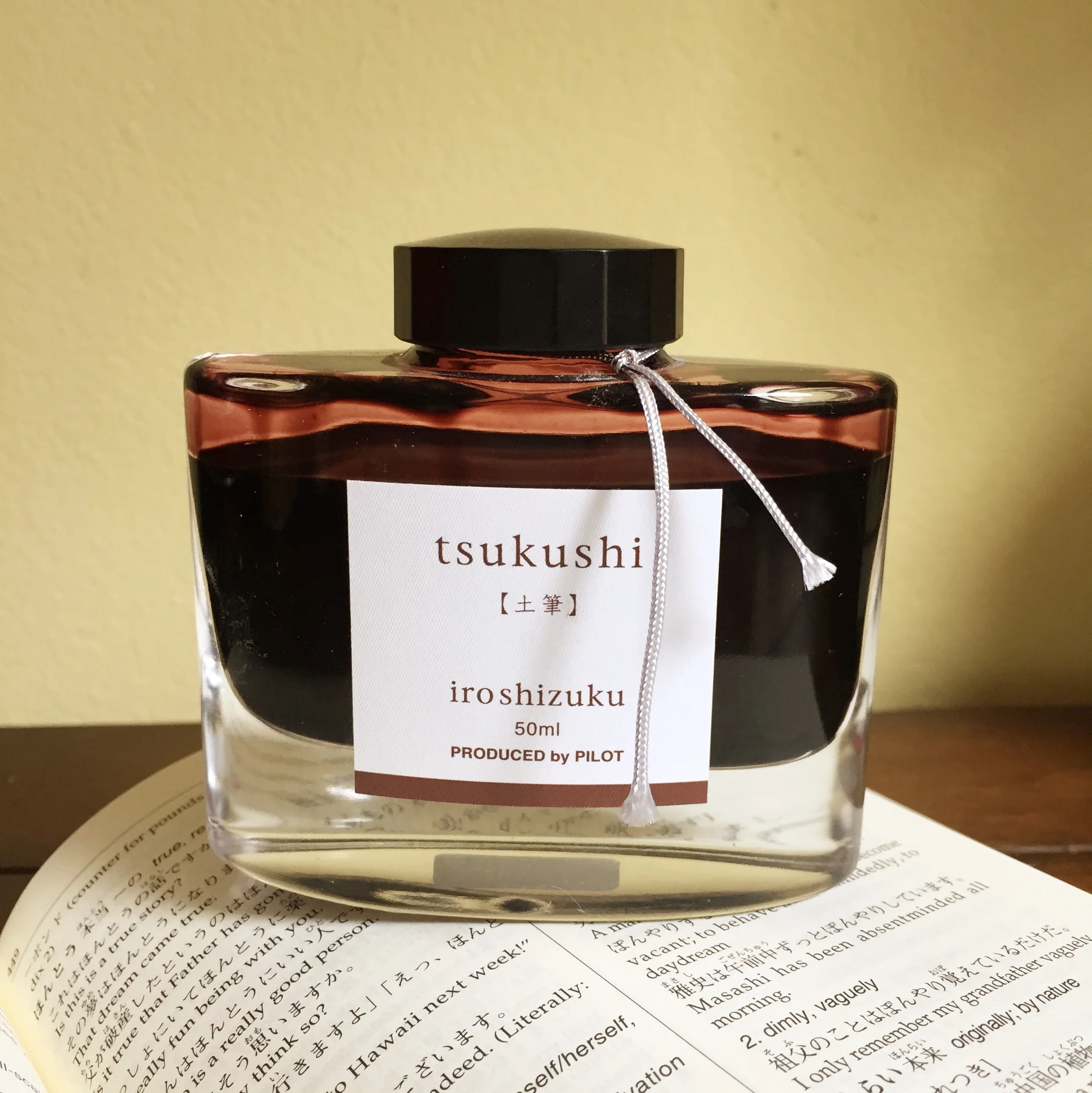
Iroshizuku Tsukushi. Click to enlarge.

Iroshizuku Tsukushi. Click to enlarge.

Iroshizuku is a line of ink produced by Pilot under their high-end Namiki brand. The natural landscape and plants of Japan inspire the colors in the line, resulting in some of the most interesting and unique ink around. Some of my earliest reviews were of Iroshizuku ink: Yu-Yake, a delightful burnt orange; Momiji, an incredible, if subtle red; Yama-Budo, a ripe, juicy purple; Kiri-Same, the color of storm clouds in a bottle; and Kon-Peki, a deep and intoxicating ocean blue. To mark my recent return to ink reviews after a two-year hiatus, I just reviewed Asa-Gao, which is a daily-writer-worthy vibrant blue.

Returning to this line of ink made me remember just how much I love it. I’ve collected lots of ink over the years, which means that the average tenure of any particular color in my daily writer is probably one month, if not less. As a result, many of the Iroshizuku inks that I collected early on have sat, lonely and unused, for a few years. So, when I went to choose the next ink in my rotation, I picked an Iroshizuku ink that I had owned for years but never reviewed: Tsukushi.

Tsukushi means “horsetail” in Japanese, and can refer to either the horsetail plant or to a wooden stick with a burned tip that’s used to create under-drawings for artwork. According to Pilot, the ink is “a soft brown, like a young horsetail awaiting the coming of spring,” which I assume refers to the plant, as the idea of a burnt stick waiting around for spring can only be explained by artistic bears coming out of hibernation and then sleepily marching into the studio for a quick sketch before wandering off to hunt salmon.

At any rate, Tsukushi is a medium brown with a hint of earthy red. It’s moderately saturated, and does exhibit nice shading with both a fine nib and a wide stub nib. As a wet writing ink, it provides sufficient lubrication across a variety writing surfaces.

As a line, Iroshizuku ink behaves best on high quality, ink resistant paper like Clairefontaine, Rhodia, or Midori. Because most of the colors are wet-writers, they have a tendency to feather on cheap, absorbent paper like bagasse or copier paper. Tsukishi squarely fits the pattern, as seen by its behavior on the various papers I tested it on.

PaperDry TimeFeatheringShow ThroughBleed Through
Rhodia12 secondsNoneMediumNone
Midori15 secondsNoneMediumNone
Bagasse3 secondsHighHighHigh
Copier2 secondsMediumHighHigh
Iroshizuku Tsukushi water test. Click to enlarge.

Iroshizuku Tsukushi water test. Click to enlarge.

Tsukushi held up better than I expected during tests of its water resistance. On the smear test, in which I drag a wet finger across the page, the ink certainly smeared – the red compounds in the ink splayed across the page – but the underlying lines still remained legible. On the drip test, in which I let a few drops of water sit on the page before blotting them up, the ink bled slightly and some came up off the page, but it still remained readable.

On the soak test, in which I ran the page under a stream of water for half a minute, Tsukushi tenaciously clung to the page. While a considerable portion of the ink was washed away, the lines remained clearly visible; at least some amount of the ink appears to have bonded to the paper, preventing it from being fully removed. While nowhere near bulletproof, it was a solid performance

Iroshizuku Tsukushi bottle. Click to enlarge.

Iroshizuku Tsukushi bottle. Click to enlarge.

Iroshizuku bottles remain one of the loveliest designs in the field. Each beautiful, 50ml bottle brilliantly showcases the color of the ink it contains. They are quite solid and the thick bottom gives each one a surprising amount of heft. Also, an indentation in the bottom of the bottle is intended to aid in soaking up the last few drops of ink. These are bottles that deserve a place of pride on top of a desk.

Brown inks have not been in my regular rotation for the past couple of years, but my time with Tsukushi is making me rethink that – especially as we head into autumn here in the US. It’s well-behaved ink with nice shading in a color that I haven’t yet found elsewhere. It’s not cheap – Iroshizuku ink runs about $28 (US) per bottle – but from its time in my pen, I’d say that it’s worth it.

Iroshizuku Tsukushi is available from:

Review notes: The hand-written portions of the review were created on 80 g/m2 Rhodia paper from a No. 18 Bloc pad. The flourished italic script was written using a Monteverde Prima with a 1.1mm steel stub nib, while the remainder of the text was written using a Visconti Homo Sapiens fitted with an EF palladium nib.

ink review: noodler's #41 brown

(click to embiggen)

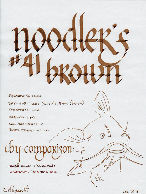
My infatuation with Noodler's bulletproof ink continues. This time, it is #41 Brown – an ink named after the junior senator from Massachusetts, Scott Brown. I'll get to the political meaning behind the name later, when I discuss the label - but for now, let it be known that the ink is a rich, dark brown with golden overtones. It is highly saturated, like most Noodler's inks, which results in a solid, clean line with little shading.

I tested the ink on a Rhodia notepad, Staples bagasse, and cheap office-quality copier paper. Compared to Noodler's Black, #41 Brown is less viscous - it doesn't enable the pen to glide across the page like an Olympic ice skater, but it is still easy and pleasant to write with. Like most Noodler's inks, it exhibits very little feathering – even on copier paper. Bleed-through is non-existent on all of the papers I tested it with; show-though is also low to nil.

Like most Noodler's inks, the drying time varies widely depending on the paper. On cheap, absorbent, copier paper, it dried to the touch on three seconds. On Staples bagasse, it dried in fifteen seconds. However, as is typical, it took over a minute to completely dry and become smudge proof on the coated Rhodia paper. 

Historically, drying time has been the major factor preventing me from extensively using Noodler's inks. As I mentioned in my re-review of Black, my writing habits have changed extensively enough that I no longer find the long drying time to be an issue. Your mileage may vary – if you are tearing through pages in a Moleskine or Rhodia Webbie, committing your latest brainstorm to paper, you may well be unhappy with the results. If you are a lefty and insist on using high quality paper and notebooks, you may be in for a rude surprise. However, if you spend all day writing on legal pads and copier paper, you may quickly fall in love.

(click to embiggen)

Noodler's bulletproof inks are designed to withstand attempts to remove them from paper. The dyes bond to the cellulose in the paper and can't be washed away by water, bleach, or other methods. Therefore, they stand up fairly well to water on most paper. On coated papers that resist ink, they may sometimes smudge, as the ink that dries upon the surface is still susceptible to being washed away.

The results of the water tests demonstrate this behavior. On the smear test, in which I run a wet finger across the paper, some of the ink travels with it, resulting in a light brown smudge. The lines remain perfectly legible, and just as bold as before, but the excess ink does make a bit of a mess.

On the drop test, in which I let droplets of water soak on the page before blotting them up, the ink performs admirably. Since the blotting paper picked up the excess ink, it's nearly impossible to tell where the water was sitting. The ink that did bond to the paper remains bold and readable.

On the soak test, in which I run the paper under a stream of water for several minutes, the bulletproof #41 Brown shows its true power. The excess inks was carried away quickly, leaving a completely legible set of lines that appear no different than how they started. Noodler's bulletproof inks don't mess around.

Nathan Tardiff, the wizard behind Noodler's ink, doesn't do things in half measures. He designs his inks to behave well on the most common paper types, instead of assuming that the user will have paper that is friendly to fountain pen ink, and he designs his bulletproof inks to stand up to all but the most determined forger.

(click to embiggen)

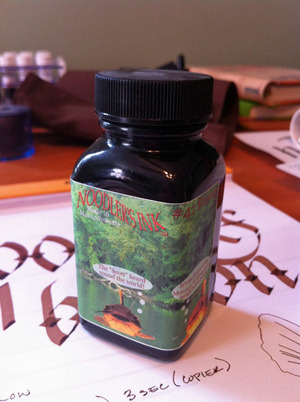
One of the other areas where Mr. Tardiff deals in extremes is in his political beliefs. He's not afraid to share them, going so far as to plaster them on the labels of his bottles. In the case of #41 Brown, the label has three catfish (the mascot of Noodler's ink), which are apparently from Lake Pearl in Wrentham, Massachusetts, residence of Senator Scott Brown. The three catfish are pictured as thinking, in order, "Cast asunder one party nepotism and feudalism," "The 'Scott' heard round the world," and "It's the people's seat! Monarchy in Massachusetts eternally results in revolution."

Collectively, they refer to the US Senate seat that was held by members of the Kennedy family (or their family friends) for over 50 years, starting in 1953 with John F. Kennedy. The family remained a presence in the US Senate until 2009, when John's brother Ted passed away from a brain tumor. In winning a 2010 special election to fill the vacated seat, Brown became the first Republican elected to the US Senate in Massachusetts since 1972.

That's quite a bit of background info to explain the label on an ink bottle – but the good Mr. Tardiff doesn't shy away from labels that need to be explained. Regardless of your political affiliation, it is fair to say that the labels bring an interesting touch to an otherwise utilitarian bottle. Aside from some specialty lines, Noodler's inks are packaged in plain, 3 oz., glass bottles that are sourced from high-volume suppliers in order to keep costs down. You could easily see these bottles filled with spices in your local grocery store. The bottles are filled to the brim, so be careful when opening – make sure you've got it somewhere flat and stable before you unscrew the cap.

Noodler's #41 Brown is a great ink – one that I'm glad that I have in my collection, and one which will see a great deal of use in my daily work. It's somber enough for business use, I'd suggest, but also interesting enough for artistic endeavors. I'll happily recommend it, as Noodler's inks are one of the best values in the industry.

Review notes: The wide strokes were made with a 6mm steel Pilot Parallel calligraphy pen, the medium strokes with a 1.9mm steel nib on a Lamy Joy, and the narrow strokes with an EF Palladium nib on a Visconti Homo Sapiens. The paper is Rhodia 80gsm.

ink review: j. herbin cafe des isles

Rating:

4.0

March 22, 2010

J. Herbin Café des Îsles

is an aptly named brown ink, as, more than anything, it resembles the color of coffee. Other reviewers have mentioned its similarity to café au lait or to espresso, depending on the wetness of the line, and I find the comparison apt. Imagine dipping one’s pen in a cup of coffee and then writing – that’s the color of this ink – and the varying strengths of one’s beverage are well represented by the low saturation and significant shading that it exhibits. It is also worth noting that, on a cream or off-white paper, it takes on a delightful sepia tone.

As with other J. Herbin inks, Café des Îsles flows easily in each pen I own. It is not as wet as Vert Empire or Bleu Myostosis, behaving more like Poussiere de Lune. The degree of feathering seems dependant on the paper in question: on Moleskine and Rhodia, there was little to no feathering, whereas on my Ecosystem notebook, the feathering was very noticeable. Regardless of paper, though, the show-through was minimal and the bleed-through nonexistent. Every paper I tried held up well to this ink, including the thin paper of a Moleskine cahier.

The dry time of this ink seems to be fairly consistent between Rhodia and Moleskine – about eight to ten seconds. However, on a very absorbent paper like the Ecosystem, the ink dried in less than three seconds – likely the tradeoff for the increased feathering. Also, as I typically write on an incline, the ink pools at the bottom of letters, thus increasing the time it takes ink to dry when compared to writing on a flat surface. Therefore, flat-writers might experience a quicker dry-time.

I consider Café des Îsles to be an ink with a high degree of character – one I find myself returning to again and again. Even though it isn’t an ink with a high level of contrast, I find its tone to be both easy to read and interesting, which makes it well-suited for journaling or other artistic endeavors.

J. Herbin fountain pen inks come in a 30ml bottle with an integrated pen rest that is suitable for displaying on top of one’s desk.

A note about the scan: While I’ve been fairly happy with the representation of the ink color in most of my ink reviews, this ink has proved to be extremely tricky to scan properly. The actual color is slightly less saturated with a hint of cinnamon.

Review materials: For the wide strokes, I used a Lamy 1.1mm steel calligraphy nib on a Lamy Safari. For the fine strokes, I used a Lamy EF steel nib on a Lamy Safari. The paper is Rhodia 80g.