paper

paper review: ecosystem sketchbook

Rating: 4.0

(click to embiggen)

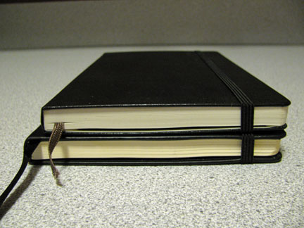
I've been a big fan of ecosystem notebooks, having positively reviewed their hardback lined journal and created an iPad cover from a large, lined softcover journal. When I found out that they were releasing a sketchbook, I made it a point to get a copy to review, and I have to say that I'm pretty pleased.

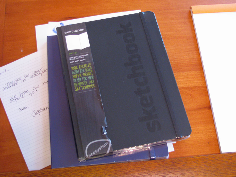
The basic setup is very similar to a standard ecosystem hardback notebook: rounded corners on the paper and cover; a bound-in, 100% organic cotton bookmark; a sturdy elastic strap to keep the cover closed; and a paper pocket inside the back cover. The cover is 100% recycled board covered with 100% post-consumer recycled paper stock, and dyed with vegetable-based ink. Unlike the standard notebooks, the word "sketchbook" is embossed on the cover.

The endpapers are printed with ecosystem's leaf pattern, and there is a space to record your name and contact information in the front. Like all other ecosystem notebooks, there is also a serial number printed on the inside back cover that, when entered on the ecosystem website, allows you to register it so that if it is ever lost it can be used to contact you. It also shows you all of the components that went into your specific batch of books, so that you can see the ecological impact of your purchase.

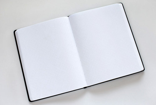
Unlike a standard hardback notebook, the sketchbook is quite a bit larger – measuring 7 3/8 by 9 7/8 inches. Inside are 128 pages of bright white, chlorine free, acid free, 80 lb. paper. I'm happy to report that my major quibble with the early hardbound notebooks – glue that crept between the signatures and locked every few pages together near the spine – is gone. Every page now lies completely flat.

(click to embiggen)

So how does this perform as a sketchbook? Quite well, I'm happy to report. The paper is generally smooth and uncoated. It takes a medium pencil, ballpoint pen, and brush pen quite well – without any hint of feathering or bleed-through. A sharpie marker bled through, as I expected, but did not transfer any ink to the underlying page. Fountain pen ink was a mixed bag – one very wet pen feathered more than I expected, but I was able to use a 6mm calligraphy nib with several inks without issue.

India ink, when used with a dip pen, fared well – it bled through in some of the wetter places, but I saw no buckling of the paper, and it did not make it through to the underlying paper, regardless. I did not try charcoal or pastel, but I suspect the level of smoothness would make it less than ideal.

Overall, I'm very happy with this sketchbook. Ecosystem continues to produce very nice notebooks that I am happy to use. I think this is one that is definitely worth checking out to see if it meets your needs as an artist.

Note: A review copy of this sketchbook was provided by Ecosystem.

paper review: rhodia webnotebook

Rating: 5.0


I’ve been keeping writing journals for well over a decade, since I began the practice back in college. During that time I’ve used a wide variety of notebooks: ruled Moleskines, leather-bound blank journals, books with black paper that had to be written on with colorful gel pens, books that cost one-dollar, books that cost sixty dollars, spiral bound, hard bound, hand-bound, large, medium, small – the list goes on and on. However, I have never abandoned a journal to move on to the next, more interesting notebook – no matter how many I had sitting at the ready.

Well, I’ve never been more tempted to jump ship than I am now – the A5 Rhodia Webnotebook is fantastic. It is slightly larger than a large Moleskine journal – the same height, but about half an inch wider. It is approximately the same thickness, though it contains 96 sheets (192 pages) of paper versus the 120 sheets (240 pages) of a Moleskine, and has similar accoutrement: a sewn-in ribbon bookmark, a pocket on the inside of the back cover, and an elastic closure that runs vertically from top to bottom. Additionally, its signatures are stitched, so it lies flat when open.


In other ways, as well, the Rhodia shows subtle differences from a Moleskine. The large, ruled notebook has 27 lines versus 30, and the rules do not stretch from edge to edge. Its paper is ivory instead of the off-white of a Moleskine. The cover is slightly softer and thicker to the touch than its competitor, and the Rhodia logo is embossed on the front center of the book rather than the lower back. Like Moleskines they come in two colors: black and, in this case, orange.

Where the Webbie markedly differs from a Moleskine is the paper. It is filled with 90 gr Clairefontaine paper, which is an utter joy to write on. As I mentioned in my Quo Vadis Habana review, Clairefontaine paper is regarded by fountain pen aficionados as some of the best in the world to write on. It is silky smooth, and even scratchy nibs glide easily over the surface.

The paper is of low absorbency and resists feathering – standing up perfectly to wet inks like J. Herbin and Iroshizuku. The trade-off is that most inks take much longer to dry on this paper than on more absorbent paper, like an Ecosystem notebook or standard copier paper. Noodler’s inks, in particular, often take upwards of a minute to dry on Clairefontaine paper when they take only seconds to dry on standard office paper.


The 90 gr paper is thick enough to stand up very well to the wettest inks. I noticed no bleed-through from fountain pen inks at all during my testing, and the amount of show-through is noticeably less than in a Moleskine notebook. It also handles other media well – I had no trouble with a garden-variety ballpoint pen. A permanent marker bled through, but did not mark the underlying page.

It’s worth pointing out that the Webnotebook has gone through several revisions here in the US. The first version used 80 gr paper that was not manufactured by Clairefontaine. From what I have heard, it was not especially fountain-pen friendly. The second version had tightly sewn signatures, which caused problems with the book lying flat. It also had a Rhodia logo emblazoned on the bottom of each page.

The third generation of Webnotebook is the one I have – and which is the one that I recommend without hesitation. The logo has been removed and the signatures loosened up enough to allow the book to lie flat without issue. Another recent development is the availability of a blank version, for those that prefer an unlined notebook.

The only cause for concern is the relative price and the availability. Moleskines are available everywhere it seems, whereas I’ve only been able to find the Webnotebook in a local stationary boutique.  Also, the Webbie costs slightly more – but at this price point, what’s a dollar or two?

I’m prepared to declare the Rhodia Webnotebook the single best Moleskine-type notebook on the market. If you enjoy the act of writing on paper, especially with a fountain pen, then this is the book for you.

Note about this review: a review copy of the Rhodia Webnotebook was graciously provided by Karen at Exaclair – Rhodia’s US distributor. Once I finish this one, I plan to buy a dozen more – all in orange.

paper review: behance dot grid journal

Rating: 2.0


The Dot Grid Journal is part of Behance’s Action Method product line – a set of paper products designed to support their Action Method project methodology. They’ve got a wide range of products, from pre-printed loose sheets to spiral bound notebooks, to stickers – the goal of which is to focus the user on action items. This journal, however, can easily be used without any reference to the Action Method. While the back pocket comes stuffed with two sets of Action Stickers and a couple of pamphlets on the Action Method, the book itself is simply a hardbound journal filled with dot grid paper.


Let me say that I really wanted to like the Dot Grid Journal. After recently discovering just how fantastic a dot grid (as opposed to a ruled grid) is, I was eager to have a notebook that utilized it. However, this particular product has the feeling of being, if not cheaply, then somewhat carelessly produced.

The 6” x 8” journal is filled with 200 pages of 60lb, 100% post-consumer, New Leaf bright white paper. The paper itself is fairly smooth, though not as smooth as Clairefontaine or Moleskine paper, and the sheets are perforated, which makes them easy to remove.

The black, “suede-to-the-touch” hardcover is embossed with “DOT GRID JOURNAL” on the front, and the Behance and New Leaf logos on the back. It is thinner than a Moleskine cover and has considerably more flex – not as much as an intentionally flexible cover, but more than a typical hardcover, which gives it an odd, flimsy feel.

The book has a wide elastic band, much like a Moleskine, along with a pocket in the back, and a sewn-in satin ribbon bookmark. While the bookmark is long, and feels fairly sturdy, the elastic band feels flimsy. I suspect that it will stretch out with repeated use.

The corners are rounded, but, at least on my copy, it appears that they were struck by the die at an oblique angle so that the sheets near the top of the book have more paper cut away than those near the bottom. The binding is stitched, and excels at laying flat – however, on my copy, the paper block isn’t square with the cover – it is about an eighth of an inch off on the back cover, resulting in a noticeable gap – which just adds to my opinion of poor quality control.

The pages themselves are printed with a light grey dot grid, which is easy to see but does a good job of disappearing into the background when you’re not focused on it. The grid is tightly spaced – so much so that it was too small for even my already small handwriting. It was ok I skipped every other line, but was too tight to write on every line. I would have preferred a 5x5 grid, like the Rhodia Dot Pads.


The New Leaf paper in the Dot Grid Journal is thinner than that used by Ecosystem in their notebooks, so I tested it with a variety of media. Here, there is some good news and some bad news. The good news is that it works well with Sharpie pens and ballpoint pens. There is a low amount of show-through there, and if those are your tools of choice, then you shouldn’t have any issues.

A Sharpie marker bled through the paper onto the following sheet. This result is not surprising, but not ideal either. However, I don’t tend to use permanent markers in my writing notebooks, so it’s not an issue for me.

Fountain pen ink is the bad news, however. On this paper, both watery inks like Iroshizuku Kon-peki and thicker, more viscous inks, like J. Herbin 1670 result in significant show-through and moderate bleed-through. Anything wet goes right through the paper. Worst of all, though, is that the dots themselves repel fountain pen ink. It looks like the pen is skipping. This is in no way a fountain-pen friendly notebook.


Overall, I can’t recommend the Behance Dot Grid notebook. I’m a fan of dot grids, and I’m still in the market for a dedicated notebook (Ecosystem, I have a product suggestion for you), but this product doesn’t fill my needs. If you’re a fan of the Action Method, or you’d still like to know more about this notebook, you can find it on Behance’s online store:

http://www.creativesoutfitter.com/Products/Dot-Grid-Journal/20

paper review: rhodia dot pad

Rating: 5.0


Ever since I started writing ink reviews, I’ve been using Rhodia notepads. Rhodia uses bright white, 80gsm, acid-free, pH neutral, Clairefontaine paper in their notepads, which is a joy to write on. Clairefontaine paper is widely considered by fountain pen aficionados to be the best paper available. It has a very smooth finish to it, which makes the pen glide across the paper, and it stands up to even the wettest ink without complaint and without feathering.

All of the Rhodia pads are staple bound, and have either an orange or black cardstock cover that is pre-scored to allow it to fold back over the spine easily. The microperforated pages are easy to remove, and the cardboard backing is sturdy enough to be able to hold the pad without separate support. The version I typically use has a pale, violet, 5x5 ruled grid, which is perfect for calligraphy – the vertical lines help with word and letter spacing, as well as providing a guide for consistent letter angles.

While there are a number of sizes available, I’ve settled on the No 16 pad, which is an A5 (6” x 8 1/4”). It’s just the right size for the reviews that I write and for practicing my calligraphy.

All in all, I’ve been very, very happy with these pads. Recently, though, I received a review copy of the new Rhodia Dot Pad, which is in all respects identical to the pads that I had been using, except that it features a dot grid instead of a ruled grid. I’m not certain who originally created dot grid paper, but whoever it was should be knighted, beatified, and inducted into the Awesome Hall of Fame.


The dot grid is essentially a normal grid, with the lines removed, and only small dots at the intersections of said lines remaining. Here, the dots are the same pale violet ink that the normal grid is printed with, which makes it both easy to read and completely unobtrusive. Initially, I was skeptical that it would provide the same guidance that a ruled grid would, but a little testing revealed that it was just as easy to use. Consider me a convert – the Dot Pad is fantastic.


The Rhodia Dot Pad is currently available in four sizes: 3 3/8” x 4 3/4”, 6” x 8 1/4”, 8 1/4” x 12 1/2”, and 16 1/2” x 12 1/2”.

You can learn more about Rhodia Dot Pads here: http://www.rhodiapads.com/collections_boutique_dotPad.shtml

Note: the Rhodia Dot Pad was provided for this review by Karen of Exaclair, the US distributor of Rhodia and Clariefontaine products.