ink

ink review: diamine damson

(click to embiggen)

Diamine Damson is the color a ninja fruit would wear when trying to sneak into an orchard under the cover of darkness. Named for fruit it resembles, Damson is a dark, dusky plum that turns nearly black when used in a wet-writing pen. In a dry-writing pen, it produces a washed-out gray-purple line. It's a moderately saturated ink - neither as rich as other Diamine inks, like Imperial Purple, or as light as J. Herbin Poussiere de Lune, which it closely resembles. When written with a broad nib, Damson produces some nice shading, but delivers a fairly consistent line in a fine nib.

Drying time is well within the realm of acceptability: on Rhodia paper, it was dry to the touch in 8 seconds, while on Staples Bagasse and cheap copier paper, it dried in 3 seconds. Feathering, too, I had no trouble with when using an extra-fine nib; the ink exhibited low feathering relative to each of the papers on which I tested it.

Purple, at least in the United States, isn't typically considered a standard ink color. Our conservative business standards are boring blue and black. Diamine Damson, though, is subtle and subdued enough that you might be able to get away with it - particularly in a wet-writing pen, like the Visconti Homo Sapiens. When used with an instrument of that sort, the color is nearly indistinguishable from black at first glance.

Diamine inks are available in a 30ml plastic bottle, which is utilitarian in appearance, and an 80ml glass bottle, which is slightly less so. The smaller plastic bottle has a neck that is very small in diameter. I found that some of my larger pens, like a Lamy 2000, would not fit all the way in, which made getting to the ink a bit of a challenge. My recommendation would be to go for the larger bottle.

Damson is an interesting ink that behaves well on a variety of paper - something I've come to expect from Diamine inks. While it's not quite vibrant enough to make it into my daily rotation of inks, I could certainly see it being exactly what someone in a more conservative business environment is looking for. If that describes you, then consider this a recommendation.

Review notes: I used a Pilot Parallel 3.8mm pen with a steel nib for the widest lines, a Lamy Joy Safari with a 1.9mm steel nib for the medium lines, and a Lamy Safari with an EF steel nib for the narrow lines. The paper is bright white 80 gsm from a Rhodia Bloc No 18.

ink questions

I've received a few requests for recommendations recently, and thought I'd share them with everyone here on Seize the Dave.

First, Nestor asks (via email):

Would you kindly suggest some inks that will not harm my nib or pen, and that will not smear on Moleskines?
Hi Nestor! I'd be happy to. First, I presume that by "not smear" you mean "fully waterproof." There are a great many inks that are smudgeproof, but few that are truly waterproof. The best group of fully waterproof inks that I've found are the Platinum pigment inks. I've reviewed the Carbon and Rose Red inks. While I warn, in the reviews, that it is extra important not to let this ink dry in one's pen, in practice I've had no issues. Don't let your pen sit uncapped, and don't let it sit unused for a month at a time, and you should be ok. The Carbon, especially, is a lovely ink to work with, and is now my reference black color.

Now, I have heard reports that Carbon can smudge on certain paper, since it dries on the surface instead of soaking in. I didn't notice this on Moleskine, but if other Moleskine users would like to chime in with their experience, I'd be happy to hear it.

Second, Ian asked, via Twitter:

Just read your review on the Behance Dot Grid Journal from last July. Did you ever find a really great dedicated notebook?
I did! The Rhodia Webbie is one of the best notebooks for fountain pen users on the market. I wholeheartedly recommend it. They've even come out with a dot-grid version, which makes an already awesome thing even more awesome.

Finally, @NoPenIntended asked (via Twitter):

I feel I should try more inks than just Noodler's. I've tried J. Herbin but found Noodler's superior. Any suggestions (w/multiple colors)?
Diamine is currently my favorite ink brand. It is consistently well-behaved and has a great selection of colors. I pointed her to the Goulet Pen Company, which is where I've purchased all of my Diamine inks. As far as I know, he offers every color they make, and he's got a good selection of online swatches to help guide you in the right direction.

ink review: sailor jentle ultramarine

(click to embiggen)

Sailor Jentle Ultramarine is one of Sailor's six new ink colors (the others being Apricot, Epinard, Grenade, Peche, and Sky High). I purchased samples of each, and Ultramarine is the first one I tested. Ultramarine is a unique color that sits on the spectrum between blue and indigo. One could call it blue-purple, but that wouldn't quite do it justice.

Historically, ultramarine was an expensive pigment that was made by grinding up the gemstone lapis lazuli. It was first used in the 6th and 7th centuries, but was most popular during the 14th and 15th centuries. It was generally reserved by European artists for the most important subjects in paintings, such as the robes of Mary and the Christ child in sacred works.

Thankfully, the color can be produced artificially today, which makes inks like this one affordable. The color is so rich and beautiful, though, that you'd be forgiven for thinking that you're still writing with ground-up lapis. Sailor Ultramarine, in particular, is moderately saturated, which produces medium levels of gem-like shading in a fine nib.

I tested this ink on five papers: cheap, office-grade copier paper; Staples "Sustainable Earth" bagasse; Ecosystem notebook paper; Moleskine cahier paper; and high-quality Rhodia 90gsm paper. I've previously reviewed Sailor Jentle Blue-Black, and its behavior was exemplary across each of these papers. I'm pleased to report that Ultramarine is equally well-behaved.

On the copier paper, it displayed a low-medium level of feathering, a medium level of show-through, and a low level of bleed-through. It was dry to the touch in three seconds. On the bagasse, the ink displayed a low level of feathering and bleed-through, and medium level of show-though. It dried in six seconds. On the Ecosystem notebook, the ink dried in two seconds, and had a low level of feathering and bleed-through. It exhibited moderate levels of show-though.

The ink's performance on the Moleskine cahier was better then many. While it took fifteen seconds to dry, I noticed absolutely no bleed-through, low levels of feathering, and only moderate show-through. Finally, on the Rhodia paper, the ink dried in just under fifteen seconds, which is within the realm of normalcy for Rhodia. As expected, it demonstrated no feathering, no bleed-through, and very little show-though.

My only complaint about the ink is that it has a very sharp chemical solvent smell to it. Some inks possess a mild odor that is only noticeable up close, but this scent is more powerful. It is similar to the smell of some permanent markers. If you're sensitive to odors in general, or specifically to that type of scent, I'd recommend trying a sample or otherwise evaluating it in person before buying.

(click to embiggen)

Ultramarine held up unexpectedly well during the water tests. The smear test, in which I ran a wet finger across the page, was first. Here, the ink did smudge, but left behind legible lines. The drip test, in which I let droplets of water sit for a minute before blotting, raised about a third the ink from the page, but left the other two-thirds intact and legible.

The soak test, in which I run the paper under a faucet for a half a minute, was the most surprising. About a third of the ink washed away, but the remaining ink remained completely legible. I'm happy to report that Ultramarine possesses a high degree of water resistance, though it is not completely waterproof.

Ultramarine is a beautiful color, and I can see it being used by less conservative businesspeople. It's easy to read, especially on white paper, so it's also useful for daily journaling or correspondence. The high degree of water resistance makes it a good choice for addressing envelopes, but the tendency to smear slightly makes it unsuitable for artistic endeavors that require it to be washed over.

Sailor inks come in a bottle that looks like a cold-cream jar - they're nothing especially interesting to look at, though they are fairly innocuous. Much more interesting than their appearance is the inclusion of a mechanism that aids the filling of pens.

A plastic funnel sits inside the mouth of the bottle. Prior to filling a pen, turn the bottle upside down (leave the lid on for this step, of course), and ink will fill the funnel. Then turn the bottle back over, and the ink will remain in the funnel for long enough to allow you to easily fill the pen. This is especially handy once the ink falls below a certain level in the bottle; it makes it very easy to get to every last drop.

I'm becoming quite a fan of Sailor inks. While I originally ordered samples of all of the new colors, I know for sure that I'll be ordering full bottles of many of them, and Ultramarine will be certainly be first.

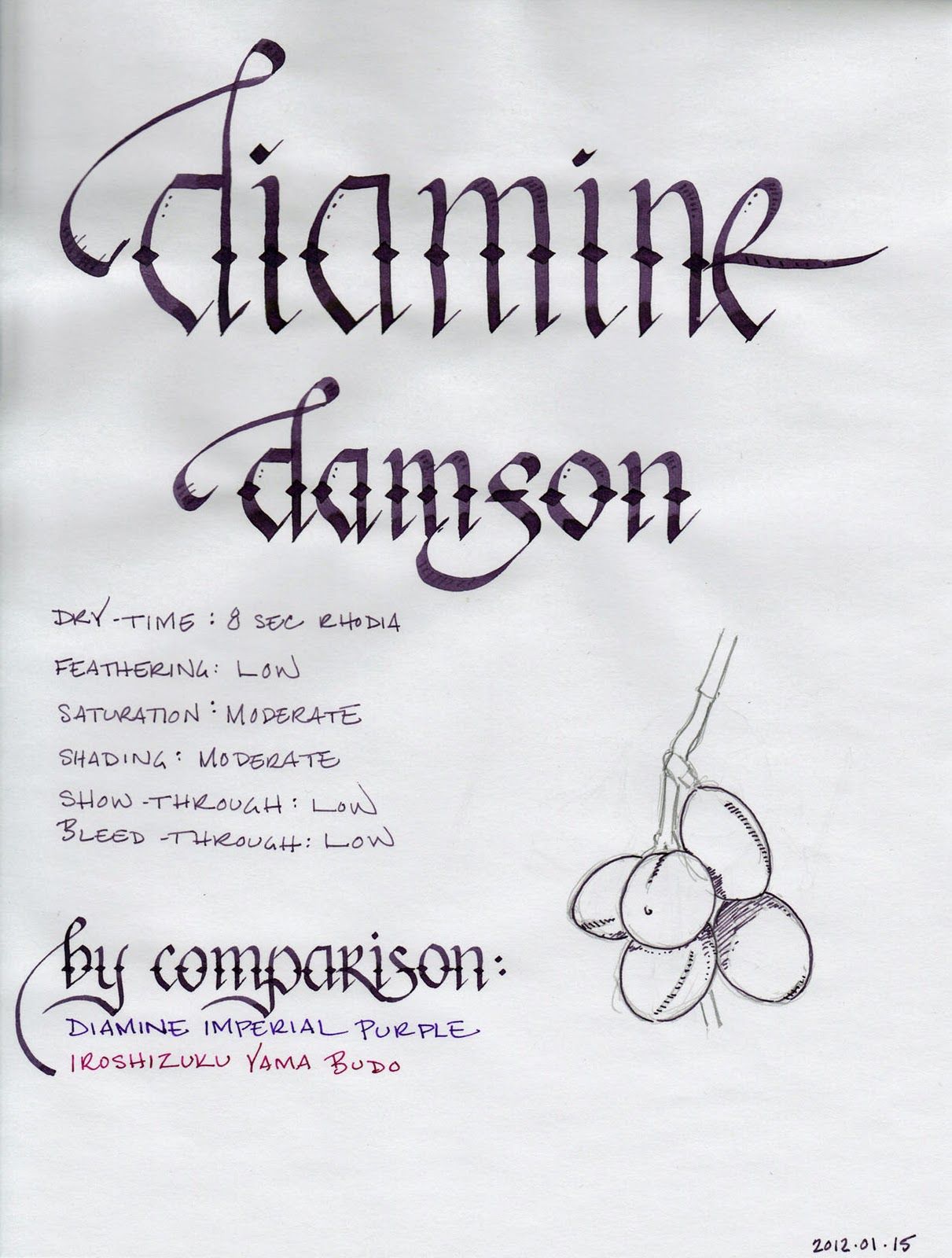
Review materials: For the wide strokes, I used two calligraphy pens: Pilot Parallel 6.0mm and 2.0mm Pelikan Script. Both have steel nibs. For the fine strokes, I used a Lamy 2000. The paper is Rhodia 80g from a No. 18 notepad.

Sailor Jentle Ultramarine is available from:

ink review: rohrer and klingner morinda

(click to embiggen)

Thanks to the generosity of the Fountain Pen Network member, Jared, I received set of ink samples. Among them were several vials of Rohrer and Klingner ink, which is a German brand that has recently become available in the US. I was immediately attracted to the vial of Morinda, which is a pretty, vibrant candy-red ink. It is similar in color to J. Herbin Rouge Caroubier, but significantly more saturated and somewhat less prone to shading.

Morinda, as it turns out is a genus of flowering plant also known as the Indian mulberry. Some of the species of plant produce a fruit which is often described as the "starvation fruit," due to its pungent and bitter flesh. Apparently it's only worth eating if you're suffering from starvation. Duly noted. More relevant to the discussion of ink, though, is the dye made from parts of the plant.

The bark of the great Morinda (morinda citrifolia) is used to make a purple brown dye, while its roots are turned into a yellow dye. The roots of the Morinda tinctoria are cultivated in India to make a bright red dye, which is the color that I assume this ink is named for.

Morinda is a wet ink, and produces a broader line than comparable inks. Unfortunately, the wet nature of the ink resulted in some undesirable behavior during my testing. I tested with four different papers: cheap office copier paper, Staples bagasse, absorbent Ecosystem notebook paper, and high-quality Rhodia webbie paper. Across all of them, I noticed a higher than normal level of feathering. It even managed to occasionally feather on the Rhodia paper, which is normally feather-proof.

On the cheap copier paper, I noticed medium levels of show-through and bleed-through, and a six second dry time. On the bagasse, the ink exhibited medium levels of bleed-though and high levels of show-though, and the same six second dry time.

The Ecosystem notebook fared a bit better, but its thicker, more absorbent paper tends to behave better with troublesome inks. Relative to other inks on Ecosystem paper, I did notice an elevated level of show-though and bleed-though with Morinda. On the Ecosystem, it dried to the touch in two seconds. Except for the afore-mentioned occasional feathering, the Rhodia paper held up well to this ink. Show-though was low and bleed-though was non-existent. On it, the ink dried in ten seconds.

(click to embiggen)

Morinda held up better than I expected when subjected to my series of water-fastness tests. On the smear test, in which I ran a wet finger across the page, the ink ran, but remained somewhat legible. I've seen other inks turn into an illegible mess, so this was somewhat refreshing.

On the drip test, in which I let droplets of water sit on the page for a minute before blotting, about fifty to seventy percent of the ink came up from the page. Certainly not ideal, but not a disaster, either. The soak test, in which I held the paper under the faucet for a few moments, lifted much of the ink that was directly targeted. However, the ink in the "splash" zone remained legible, which is not often the case. Overall, Morinda provides a modicum of water resistance - certainly more than I expected. It is a mark in its favor.

I dearly love red inks. They are by far my favorite color to write with. However, they are unsuited for most business applications, save for proofing and editing. R&K Morinda is no different in this regard. It is, when compared to other red inks, particularly bright - though not blindingly so. For those with more tolerant eyes, it could certainly be appropriate for daily personal use.

Rohrer and Klingner inks are sold in fifty milliliter bottles. The bottles are fairly utilitarian, though they do have pleasantly colored labels.

This is my first experience with Rohrer and Klingner inks, and I'm interested in seeing more. Regarding Morinda, specifically, I'm of two minds. The color is lovely, and it is pleasant to write with, but the higher than normal degree of feathering, show-through, and bleed-through limit my enthusiasm. I'm hoping that other R&K inks are somewhat better behaved. For those that use high-quality paper, Morinda is worth a look, especially if you do not already own an ink in this color family. For those that write primarily on office-grade paper, I'd consider trying a different brand.

Note on the scan: the Morinda ink washed out a bit when scanned in, so the actual color is a tad more vibrant and saturated. It is a fairly accurate representation of the character of the ink otherwise.

Review notes: for the widest lines, I used a Pilot Parallel calligraphy pen with a 6.0mm steel nib and a Pelikan Script pen with a 2.0mm steel nib. The fine lines were written using a TWSBI Diamond 530 with an EF steel nib. The paper is Rhodia 80gsm.

Rohrer and Klingner inks are available from: