diamine

ink review: diamine midnight

Rating: 4.5

(click to embiggen)

When I first put Diamine Midnight to paper, I thought to myself that it was a nice, but not particularly interesting dark blue ink. Then I looked closer, and closer, and closer – and got drawn right in. For those willing to pay attention, this ink has a wonderful sense of depth that captures the variability and mystery of the nighttime sky. In fact, in the more saturated sections, there's a hint of red that peeks out, giving it an almost sinister look. This is the dark blue of a steampunk starscape – of Victorian London, where Dracula and Jack the Ripper lurk in the shadows.

It is a moderately saturated dark blue with a hint of indigo. In a fine nib, it exhibits a modicum of shading – just enough to give it a rich, complex feel. In a calligraphy nib, one can see significant areas of high and low saturation, and a mysterious red border between the two. The color is not particularly affected by the color of the paper – on both the bright white Ecosystem and off-white Rhodia webbie, the color remained consistent.


Midnight is a well-behaving ink, a characteristic that I've found in each of the Diamine inks I've reviewed so far. On both absorbent paper, like Ecosystem, and resistant paper, like Rhodia, feathering was not noticeable. Show through was noticeable on thinner paper, like a Moleskine cahier, but otherwise very low. I noticed only one very minor issue of bleed-through with any of the paper and pen combinations – the 6mm Pilot Parallel calligraphy pen caused a tiny spec to peek through.

(click to embiggen)

As with the other Diamine inks I've reviewed, water resistance is not an included feature. The smear test, in which I rub a wet finger across the page, obscured the lines and left a blue smudge behind. The drip test, in which I let droplets of water sit on the page for about a minute before blotting them, left ghostly, pale blue impressions of the lines behind.

The soak test, in which I run the paper under a faucet for half a minute, did a great job of washing the ink right off the page. Midnight is not a waterproof ink – it doesn't even achieve the "addressing an envelope" level of resistance – so I'd recommend leaving it for journals or other things that have a low risk of encountering moisture.

(click to embiggen)

Diamine inks are available in a 30ml plastic bottle and an 80ml glass bottle, both of which are utilitarian in appearance. The smaller plastic bottle has a neck that is very small in diameter. I found that some of my larger pens, like a Lamy 2000, would not fit all the way in, which made getting to the ink a bit of a challenge. My recommendation would be to go for the larger bottle.

Blue inks are one of the mainstays of the corporate environment, and Midnight would fit in quite nicely. It's a dark blue that's easy to read on both ivory and white paper, and isn't bright enough to offend anyone's sensibilities. It is also a great choice for personal correspondence, having a nice, warm, rich tone. Finally, it's also a great candidate for calligraphy and other artistic endeavors – that mysterious red aura that it develops adds an unexpected depth of character to the work.

Diamine Midnight doesn't quite knock Noodler's Kung Te-Cheng out of the top spot on my list of blue inks, but I think it easily took second. If you like dark blue inks, this is an easy choice to add to your collection. Now I just have to buy an 80ml bottle to replace the sample I was sent in order to make sure I've got enough on hand to last a long time.

Review materials: For the wide strokes, I used two calligraphy pens: Pilot Parallel 6.0mm and 3.8mm pens. For the "by comparison" line, I used a Noodler's Creaper Flex Nib pen. All three have steel nibs. For the fine strokes, I used a Lamy EF steel nib on a Lamy Safari. The paper is Rhodia 80g.

Note on this review: a sample of this ink was provided for review purposes by Diamine Ink.

Diamine Midnight is available from:

ink review: diamine monaco red

Rating: 4.5

(click to embiggen)

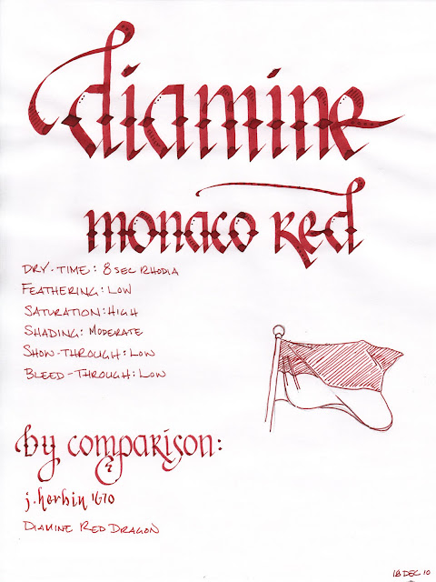
Monaco Red is another great red ink from Diamine. It's an earthy, orange red with brick undertones – very reminiscent of J Herbin 1670. It is less blue than Diamine Red Dragon and less brown than Diamine Oxblood. According to at least one source, this ink was formulated by Diamine at the special request of the Crown Prince of Monaco. I presume the ink was engineered to match the red in the Monegasque flag and coat of arms.

It is a saturated red that exhibits a moderate level of shading in a fine nib and a superb level of shading in a wide or wet nib. The color is not dramatically affected by the color of the paper – on both white and ivory Rhodia paper, the ink appears nearly the same. It is also well-behaved on each paper I used to test it. Show-through was low, overall, and bleed-through only occurred on the very thin paper of a Moleskine cahier – and that was minimal.

Diamine Monaco Red provides a nice level of lubrication, allowing an extra-fine nib to glide easily across the page. Drying time is quick as well – only 8 seconds on the normally long-drying Rhodia paper and 4 seconds on the absorbent paper of an Ecosystem journal.

(click to embiggen)

Water resistance is, to my mind, the singular issue with this ink. A smear test, in which I ran a wet finger across the page, did a great job of obliterating the lines and creating a red mess.

A drip test, in which I let drops of water set for about a minute before blotting them, was even worse. The ink came up almost entirely from the areas where the water touched the paper. Worst of all, though, was the soak test, where I run the paper under a stream of water. The ink jumped off the page so quickly, I would have suspected that it was allergic to it. Perhaps they offended each other. Either way, it came up so easily that I cut the test short after only a few seconds.

(click to embiggen)

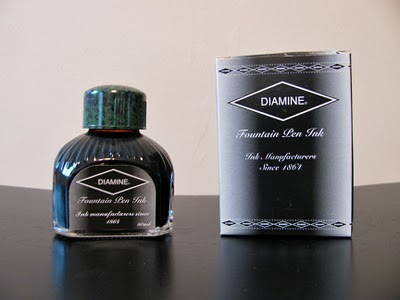
Diamine inks are available in a 30ml plastic bottle, which is utilitarian in appearance, and an 80ml glass bottle, which is slightly less so. The smaller plastic bottle has a neck that is very small in diameter. I found that some of my larger pens, like a Lamy 2000, would not fit all the way in, which made getting to the ink a bit of a challenge. My recommendation would be to go for the larger bottle.

Red inks are not traditionally workplace appropriate, though I have no qualms about using them. Most, however, would find Monaco Red to be no exception – unless you happen to be the Crown Prince of Monaco, I suppose – and then who's going to stop you anyway? It's good to be the king, no? At any rate, this ink is easy to read, to my eyes – not too bold and not too light – and therefore good for journaling and other personal use.

I continue to be impressed by Diamine, and Monaco Red is an impressive ink. I'm happy I bought the large 80ml bottle – I can see this making its way into my standard repertoire for everyday use and for calligraphy. If you, like me, enjoy red inks, then I will not hesitate to recommend adding it to your collection.

Review materials: For the wide strokes, I used three calligraphy pens: Pilot Parallel 6.0mm and 3.8mm pens, and a 1.9 mm Lamy Joy. All three have steel nibs. For the fine strokes, I used a Lamy EF steel nib on a Lamy Safari. The paper is Rhodia 80g.

ink review: diamine sepia

Rating: 4.0

diamine sepia

Diamine Sepia is a wonderful fall color, reminding me of golden fields of wheat that sway in the wind of a cool November day. It is a golden-brown ink with a low level of saturation and an amazing ability to produce beautiful shading. While the color of some inks varies with the shade of paper, Sepia is consistent, appearing just slightly darker on the off-white paper of a Moleskine journal than on the bright-white paper of a Rhodia pad. 

Like other Diamine inks I have reviewed, Sepia behaves nicely on a wide variety of paper. Even with the fine-medium nib on a Noodler's pen, which lays down a thicker line than my EF nibs on my Lamy Safari pens, I noticed no bleed through and very little show-through on Moleskine journal paper.

The drying time for this ink was also very friendly. On the typically long drying Rhodia paper, Sepia took ten seconds to dry to the touch. On an absorbent paper, like standard copier paper, it took four seconds to dry, which should make it a good choice for left-handed over-writers. I also noticed no special tendency to feather on any of the paper I tested it on.


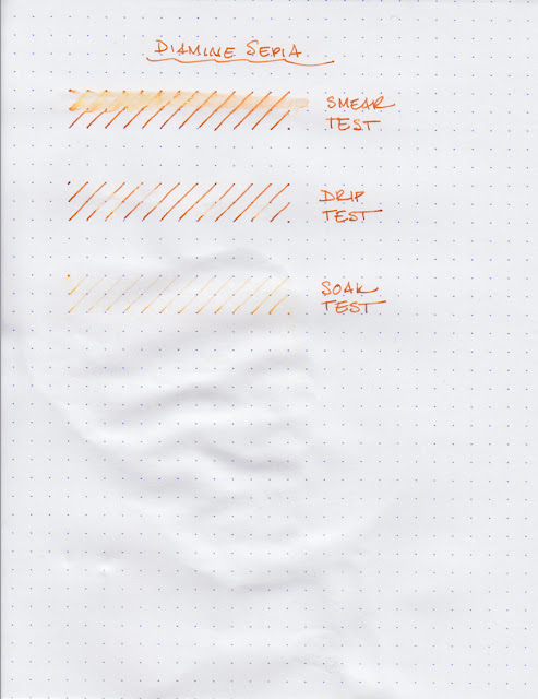
Where Sepia falters, for those who are concerned about such things, is in its resistance to water. For the smear test, I dragged a wet finger across the page, which did a good job of leaving a golden smear and obliterating most of the lines. For the drip test, I let droplets of water stand for about a minute before blotting them up. The water did an effective job of pulling the ink from the paper.

The last test, the soak test, was conducted by running the paper under the faucet for about five seconds. In that time, the vast majority of the ink had washed away. If I'd kept going, I could have easily washed it completely off. As an ink, it's not suitable for addressing envelopes, and I'd refrain from writing out recipes using this ink, if your cookbook is as sauce-stained as mine.


Diamine inks are available in a 30ml plastic bottle and an 80ml glass bottle, both of which are utilitarian in appearance. The smaller plastic bottle has a neck that is very small in diameter. I found that some of my larger pens, like a Lamy 2000, would not fit all the way in, which made getting to the ink a bit of a challenge. My recommendation would be to go for the larger bottle.

Diamine Sepia is a very pretty ink and well behaved. While I don't make much use of brown inks, personally, I can see this being very appealing to those that like do. I plan on using it any time I need a "vintage" or faded look for a calligraphy project.  I've had good experiences with all of the Diamine inks I've reviewed so far, so I don't hesitate to recommend it to those that are looking for a harvest gold color.

Review Notes: for the wide strokes, I used a Lamy 1.9mm steel calligraphy nib on a Lamy Joy. For the narrow strokes, I used the fine medium steel nib on a Noodler's piston fill pen. The paper is Rhodia 80gsm from a No. 16 Rhodia Bloc Pad.

Note on this review: a sample of this ink was provided for review purposes by Diamine Ink.

diamine imperial purple water test


Greg asked:
I just read your review at:
/2010/10/ink-review-diamine-imperial-purple.html

Very nice.  How permanent is this ink?

Well, as you can see above - not very. The smear test, which is a wet finger dragged across the ink, left a big, purple streak. The lines range from obliterated to semi-readable.
The drop test, in which I drip water, let it soak for a second, and then blot it up, fared a little better. I did notice that the blotting lifted a lot of ink up, but you can still make out the lines.
The soak test was conducted by running the paper under water for about five seconds. Normally, I’d let it run longer, but the ink was washed away at such a rapid rate, I was worried that there would be nothing left to show!
In summary, it’s a beautiful ink, but I wouldn’t even use it to address envelopes, as a stray raindrop or two could render the ink illegible.