calligraphy

flex vs. italic nibs

Loomi asked:

Would you recommend an ink pen to start with Italic writing?
I have seen videos of the Maby Todd pen with the gloriously flexible nib.
refer to video linked at http://youtu.be/Z_hB8IYR69Q
Is that one too advanced for a beginner like me? 
What is a starting pen of Italic writing? 
Excellent question! While italic and flexible nibs are both capable of producing significant line variation, there is a definite difference between the two. Italic nibs look like a chisel – they are wide and thin and generally not flexible. The produce line variation based on their angle on the paper. I use a Lamy Joy with a 1.9mm italic nib for most of my ink reviews, and is what you can see in the example below.

Flexible nibs, like the one in the video linked above, are generally the same width as a normal fine, medium, or bold nib, but the tines of the nib respond to the pressure of your hand. They separate, allowing more ink to flow, and thus produce a wider line. While there are some pen manufacturers that produce flexible nibs today, like the Namiki Falcon, vintage flexible nibs generally have a much higher degree of flex. Many nibmeisters will also modify modern nibs to add flexibility to them. For the example below, I actually used a flexible nib on a dip pen.


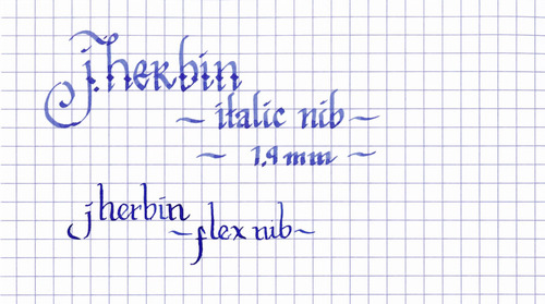
Personally, I think that italic nibs are much easier for a beginner to learn with. It’s much easier to control the angle that you hold your pen than to control the pressure as you’re learning. Plus, most calligraphy hands are designed for italic nibs, not flexible ones – so if you’re interested in learning classic italic, uncial, and roman scripts, then that’s where I’d recommend that you start.

how I learned to write pretty

Recently, I’ve received many compliments regarding my calligraphy, which I consider to be both flattering and encouraging, as I’m relatively new to the art. However, many of those who have offered compliments have lamented their own lack of ability in calligraphy. Since this is precisely the position I was in last year, I’d like to offer the lessons I’ve learned to try and help others.

By no means am I an expert – I’ve only been practicing on and off for about a year and my knowledge is still limited. However, before I started, I felt overwhelmed by the options: nibs, inks, instructions, etc. The following is a summary of what worked for me.

First, the equipment: while there are a number of different tools for calligraphy, including the traditional dip pens, I was already familiar with fountain pens. Therefore, I purchased a Lamy Safari with a 1.1mm calligraphy nib.

Second, the paper: when doing calligraphy, one puts a lot of ink down on paper, so something durable is desirable. Also, having a grid is extremely helpful for practicing spacing and overall consistency. So, I chose a Rhodia Block pad. Rhodia paper stands up to fountain pen ink extremely well and the microperf paper tears out easily.

Third, the instruction book: I read through a number of Amazon reviews, and then picked The Calligrapher’s Bible: 100 Complete Alphabets and How to Draw Them. This book does exactly what the title indicates – it provides the reader with a large number of alphabets and then gives the stroke order and instructions for pen angle and pen movement through each.

Armed with all of the above, I was able to experiment. I picked a couple of hands from the book above, inked up my pen, and started to practice. I began trying to replicate the basic letter forms from the examples, following the stroke order listed. After I got comfortable with them, then I practiced writing words, which allowed me to understand letter spacing and how to connect one letter to another. Only then did I move on to writing out full works for further practice.

As with picking up any new skill, practice isn’t simply about repetition, it’s about making mistakes and learning from them. That’s why a pad with disposable paper is essential. When you make a mistake, you can tear off the offending sheet, and then use it as a reference for what not to do on the next one. For each of my ink reviews, for example, I will make several drafts before I create one that I’m happy with.

It is also important to note that calligraphy is not done at the speed of handwriting. It is drawn at a much more deliberate pace. While I’ve gotten a bit faster over the past year, I still measure my pace in seconds per letter, not letters per second.

Finally, once you’re comfortable with a particular hand, then it is time to start experimenting. Make the script your own, add in flourishes and ligatures, and above all, have fun!