ink reviews

ink review: j. herbin rouge opera

J. Herbin Rouge Opera

J. Herbin Rouge Opera should come with a warning. If you fill your fountain pen with it, you will, in short order, develop a compulsion to listen to Puccini, Verdi, and, perhaps, Bizet. The ink is the color of a heavy, velvet stage curtain and of walls lined with brocade. It's the color of soprano Anna Netrebko's dress in the 2005 staging of La Traviata. It's each of those shades from moment to moment, and it's all of them at once. Just try to avoid humming a little Wagner once your pen is inked up.

Practically speaking, the color is a dusky red with a hint of maroon. It exhibits a high degree of shading that ranges from brick red to a dark pink. Rouge Opera's behavior, pleasantly, is decidedly less melodramatic than its color. It took 4 seconds to dry on Rhodia paper and Staples bagasse. On cheap, office-grade copier paper, it dried nearly instantaneously.

Like many of the J. Herbin inks, Rouge Opera exhibits a high degree of feathering on low-quality paper. Bagasse fared the worst, with my Visconti Homo Sapiens producing a medium-weight line from a fine nib. On copier paper, the feathering was noticeable, but tolerable. As always, Rhodia and Clairefontaine paper fared the best.

On Rhodia and Clairefontaine paper, Rouge Opera results in low levels of bleed through and moderate show-through. I noticed significant bleed-through and show-through on both Staples bagasse and on copier paper, however. It is something to be aware of if one's intent is to use both sides of a page.

J. Herbin Rouge Opera water test

Most J. Herbin inks that I've reviewed have not been on speaking terms with water. Bleu Pervenche, for example, ran screaming at the slightest hint of moisture, and Terre de Feu faded into the background, leaving only a shadow of its former self behind. I was expecting the same behavior from Rouge Opera, but was, quite frankly, astounded at how it actually responded.

The smear test, in which I run a wet finger across the page, did result in significant smearing. However, as you can see, the words on the page are still completely legible – most of the ink remains bonded to the paper. The drip test, in which I let droplets of water sit on the page before blotting them up, resulted in feathering and lightening of the lines, but still left the words completely legible.

The soak test was the most surprising of all. While some ink washed away, and what was left feathered noticeably, all of the words are still completely legible and visible. I suppose one could refer to it at this point as Rouge Operetta – still of exceptional quality, just a little bit lighter.

J. Herbin Rouge Opera bottle

J. Herbin fountain pen inks come in a 30ml bottle with an integrated pen rest that is suitable for displaying on top of one's desk. The red label on this bottle is fairly representative of the ink inside.

Rouge Opera is a beautiful, dramatic, and on certain types of paper, well-behaved ink; it's certainly a color that lives up to its title. The excellent water-resistance is an unexpected bonus that puts this J. Herbin ink over the top. Keeping the high degree of feathering on poor quality paper in mind, I highly recommend it.

Review Notes: the fine lines were made with a Visconti Homo Sapiens pen with an extra fine 23k palladium nib. The bold lines were made using a Lamy Joy calligraphy pen with a 1.9mm steel nib. The paper is 80gsm from a Rhodia Bloc Pad.

ink review: j herbin bleu pervenche

j herbin bleu pervenche writing sample

J. Herbin makes watercolor-lovely ink. Some colors, like Bleu Myosotis, give the impression that the viewer is looking at a field of wildflowers through a set of gauzy curtains in the pale light of a spring morning. Bleu Pervenche, on the other hand, places the viewer on a rocky outcropping, gazing out at the blue-green waters of the Mediterranean, one hand against the brow to shield his eyes, squinting in the summer sun.

It's an extremely lovely, bold color, even if it is puzzlingly named. Pervenche means periwinkle in French, and this color doesn't resemble the periwinkle that I'm familiar with in the slightest. It's not a light blue-purple, but a bright, bold blue that leans toward the green end of the spectrum (as opposed to the purple end).

I prefer to use new ink for a week or two before I review it. In this case, I cleaned the Noodler's Black out of my trusty Visconti Homo Sapiens and filled it with Bleu Pervenche. While few inks are as smooth as Black, I was pleasantly surprised at how well Bleu Pervenche handled. It is wet-writing ink, which allowed the pen to move easily across the surface of most paper types I used.

The ink exhibits a high degree of feathering on normal copy paper and Staples Bagasse. It generally behaves well on coated papers like Rhodia pads or Clairefontaine notebooks, but does feather when using wet-writing pens like the Pilot Parallel calligraphy pens in the writing sample above.

Like most J. Herbin inks, saturation is low, which enables the loveliest characteristic of Bleu Pervenche to shine: the high degree of shading that it exhibits even in fine-writing pens. Show- and bleed-though were both moderate on Rhodia paper, though I didn't notice it at all on slightly heavier Clairefontaine notebook paper.

j herbin bleu pervenche water test

J. Herbin inks aren't known for being water resistant, and Bleu Pervenche is no exception. When I ran my wet finger across the page for the smear test, it erased most of the lines, and left a blue haze in its wake. The drip test, in which I let a several drops of water sit on the page for a minute before blotting them up, wasn't much better – most of the ink came up with the blotter. The soak test, where I run the paper under water for thirty seconds, was the most impressive of all – nearly all of the ink was washed away, and only the faintest of lines remains.

j herbin bleu pervenche bottle

J. Herbin fountain pen inks come in a 30ml bottle with an integrated pen rest that is suitable for displaying on top of one's desk. The bottles are slightly challenging to use with a large-nibbed pen, though – I had to tilt the bottle to get a deep enough well to fully submerge my pen.

Despite the high degree of feathering and the logistical issues of the small bottle, I have no hesitation in recommending J. Herbin Bleu Pervenche for those that enjoy bold, vibrant colors. It's nearly impossible to be unhappy when writing with this ink. It's an instant pick-me-up, and worth picking up to add to your collection.

Review notes: The fine lines were created by a Lamy Safari that was equipped with a steel EF nib, the medium lines with a Lamy Joy 1.9mm calligraphy pen, and the broad lines with 6.0mm and 3.8mm Pilot Parallel calligraphy pens. The paper is bright white, 80gsm, from a Rhodia Bloc pad.

ink review: noodler's liberty's elysium

(click to embiggen)

There are many good things to say bout the Goulet Pen Company, but one of them is the degree of care they take in packaging items for shipment. Most bottles of ink are individually wrapped to insure against leakage, then are wrapped in several layers of bubble wrap to prevent them from getting banged around, and then again in plastic wrap to protect them against the elements. As you might expect, I've never had any item arrive in a damaged state, despite packages being left in the rain, left in the snow, and left in the rain/snow combination whimsically referred to as a "wintery mix."

Beyond the care taken, though, the most distinctive thing about a shipment from the Goulet Pen Company is the bright, blue packaging material. If you've ordered from them before, you'll know exactly what I'm talking about. They also use a very similar blue in their ink drop logo. So when the newest Goulet-exclusive ink was announced, many people speculated that we'd see something in "Goulet blue."

Liberty's Elysium, manufactured by Noodler's Inks, is exactly that lovely, cool shade of blue. It is vibrant enough to provide great contrast on white paper, but subdued enough to be easy to read. It is brighter than Waterman Florida Blue, but not nearly as obnoxious as Noodler's Baystate Blue. Like most Noodler's inks, Liberty's Elysium is highly saturated and produces a bold line with a low level of shading.

It is wet writing ink that dries very quickly. Show-through was moderate on each of the paper types I tested: fountain pen-friendly Rhodia, Staples bagasse notepads, and cheap, office-quality copier paper. In my Clairefontaine notebooks, I was able to use both sides of the paper without any issues.

Bleed-though was likewise very good, except where I was using wet-writing calligraphy pens. Even then, it only occurred where the ink pooled on the paper at the bottoms of letters.

Noodler's Liberty's Elysium caused a moderate amount of feathering in wet writing pens and on cheap paper. This is evident in the "by comparison" section of the written review, were the "b" and "r" both suffer from severe feathering. On office-grade copier paper, and on Staples bagasse, it produced a medium line instead of a fine line. Generally, though, the feathering is tolerable – on good quality, ink resistant paper the behavior is almost non-existent.

Yet, despite how wet the ink is, my single criticism of Liberty's Elysium is that is dries too quickly. Those who have read my other reviews may find this ironic, as long dry times have been my chief complaint about other Noodler's inks. However, when using my Visconti Homo Sapiens, leaving the cap off for more than five seconds causes the pen to start hard and occasionally skip on the initial stroke. Drying quickly on paper is an admirable quality. Drying quickly in my pen is less so.

Regardless, on Rhodia paper, Liberty's Elysium dried to the touch in about 5 seconds. On Staples bagasse, it took about 10 seconds, but on office-grade copier paper, it was dry in less than three seconds.

Liberty's Elysium was originally marketed as bulletproof ink, which caused some controversy when it was released. The term "bulletproof" isn't a regulated term, nor is it a commonly accepted industry term. It is a marketing term coined by Nathan Tardiff, the man behind Noodler's Inks, but it is one that has been applied consistently across the Noodler's line. The fountain pen community has come to expect a specific set of behavior from these inks.

Noodler's bulletproof inks are designed to withstand attempts to remove them from paper. The dyes bond to the cellulose in the paper and can't be washed away by water, bleach, or other methods. Therefore, they stand up fairly well to water on most paper. On coated papers that resist ink, they may sometimes smudge, as the ink that dries upon the surface is still susceptible to being washed away, but the color and intensity of the ink remain stable.

(click to embiggen)

The water test reveals the trouble with marketing Liberty's Elysium as bulletproof. The smear test, in which I run a wet finger across the page, results in a blue smudge and significant travel of the ink across the page. The lines are still intelligible, but they are significantly diminished in intensity.

The drip test, in which I let several drops of water sit on the page before blotting them up, results in similar behavior: ink that bleeds and smudges, and is reduced in intensity. The soak test, in which I run the paper under a stream of water for thirty seconds, results in a significant portion of the ink being washed away and some feathering. This is not the behavior that most Noodler's customers have come to expect from their bulletproof ink.

However, a closer look at the soak test reveals that the lines that remain are completely legible and fairly bold. It appears that the ink is partially bulletproof – some portion of the ink remains resistant to removal while the rest can be washed away. This is similar in behavior to Noodler's Black Swan in Australian Roses, which is marketed as "partially bulletproof." Consequently, Noodler's Ink and Goulet Pens have changed the designation of the ink to match, which, in my opinion, nicely solves the problem.

Nathan Tardiff is a man who enjoys the study of history. Many of his inks have historic elements in both name and label design. It's the most common motif beyond the Noodler's catfish mascot. With a name like Liberty's Elysium, one would expect a historically themed label, and Mr. Tardiff does not disappoint. The label is packed with scenes from the American colonial period, including Patrick Henry's quote, "Give me liberty, or give me death!" Brian Goulet explains the meaning behind the other scenes and quotes on the label in the video where he introduces the ink.

It is fair to say that the labels bring an interesting touch to an otherwise utilitarian bottle. Aside from some specialty lines, Noodler's inks are packaged in plain, 3 oz, glass bottles that are sourced from high-volume suppliers in order to keep costs down. You could easily see these bottles filled with spices in your local grocery store. The bottles are notoriously filled to the brim, so be careful when opening – make sure you've got it somewhere flat and stable before you unscrew the cap.

Liberty's Elysium is great ink worthy of the great people who work at Goulet Pens. It's a beautiful blue that's just subdued enough for the office, but still interesting enough for personal use. It behaves moderately well on a wide variety of paper types, and it is one of the few blue (not blue-black) inks with this level of permanence. My only quibble is the behavior of the ink in my Visconti pen – drying too quickly in the nib. Beyond that though, the Goulets should be proud of their newest exclusive ink.

Review notes: the wide strokes were made using a Pilot Parallel calligraphy pen with a 3.8mm steel nib. The medium strokes were made with a Pelikan Script 2.0 pen with a 2.0mm steel nib. The fine lines were made using a Visconti Homo Sapiens pen with an EF palladium nib. The paper is Rhodia 80gsm from Rhodia Bloc pads.

Noodler's Liberty's Elysium is available exclusively from:


ink review: noodler's #41 brown

(click to embiggen)

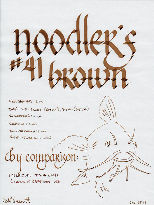
My infatuation with Noodler's bulletproof ink continues. This time, it is #41 Brown – an ink named after the junior senator from Massachusetts, Scott Brown. I'll get to the political meaning behind the name later, when I discuss the label - but for now, let it be known that the ink is a rich, dark brown with golden overtones. It is highly saturated, like most Noodler's inks, which results in a solid, clean line with little shading.

I tested the ink on a Rhodia notepad, Staples bagasse, and cheap office-quality copier paper. Compared to Noodler's Black, #41 Brown is less viscous - it doesn't enable the pen to glide across the page like an Olympic ice skater, but it is still easy and pleasant to write with. Like most Noodler's inks, it exhibits very little feathering – even on copier paper. Bleed-through is non-existent on all of the papers I tested it with; show-though is also low to nil.

Like most Noodler's inks, the drying time varies widely depending on the paper. On cheap, absorbent, copier paper, it dried to the touch on three seconds. On Staples bagasse, it dried in fifteen seconds. However, as is typical, it took over a minute to completely dry and become smudge proof on the coated Rhodia paper. 

Historically, drying time has been the major factor preventing me from extensively using Noodler's inks. As I mentioned in my re-review of Black, my writing habits have changed extensively enough that I no longer find the long drying time to be an issue. Your mileage may vary – if you are tearing through pages in a Moleskine or Rhodia Webbie, committing your latest brainstorm to paper, you may well be unhappy with the results. If you are a lefty and insist on using high quality paper and notebooks, you may be in for a rude surprise. However, if you spend all day writing on legal pads and copier paper, you may quickly fall in love.

(click to embiggen)

Noodler's bulletproof inks are designed to withstand attempts to remove them from paper. The dyes bond to the cellulose in the paper and can't be washed away by water, bleach, or other methods. Therefore, they stand up fairly well to water on most paper. On coated papers that resist ink, they may sometimes smudge, as the ink that dries upon the surface is still susceptible to being washed away.

The results of the water tests demonstrate this behavior. On the smear test, in which I run a wet finger across the paper, some of the ink travels with it, resulting in a light brown smudge. The lines remain perfectly legible, and just as bold as before, but the excess ink does make a bit of a mess.

On the drop test, in which I let droplets of water soak on the page before blotting them up, the ink performs admirably. Since the blotting paper picked up the excess ink, it's nearly impossible to tell where the water was sitting. The ink that did bond to the paper remains bold and readable.

On the soak test, in which I run the paper under a stream of water for several minutes, the bulletproof #41 Brown shows its true power. The excess inks was carried away quickly, leaving a completely legible set of lines that appear no different than how they started. Noodler's bulletproof inks don't mess around.

Nathan Tardiff, the wizard behind Noodler's ink, doesn't do things in half measures. He designs his inks to behave well on the most common paper types, instead of assuming that the user will have paper that is friendly to fountain pen ink, and he designs his bulletproof inks to stand up to all but the most determined forger.

(click to embiggen)

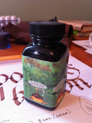
One of the other areas where Mr. Tardiff deals in extremes is in his political beliefs. He's not afraid to share them, going so far as to plaster them on the labels of his bottles. In the case of #41 Brown, the label has three catfish (the mascot of Noodler's ink), which are apparently from Lake Pearl in Wrentham, Massachusetts, residence of Senator Scott Brown. The three catfish are pictured as thinking, in order, "Cast asunder one party nepotism and feudalism," "The 'Scott' heard round the world," and "It's the people's seat! Monarchy in Massachusetts eternally results in revolution."

Collectively, they refer to the US Senate seat that was held by members of the Kennedy family (or their family friends) for over 50 years, starting in 1953 with John F. Kennedy. The family remained a presence in the US Senate until 2009, when John's brother Ted passed away from a brain tumor. In winning a 2010 special election to fill the vacated seat, Brown became the first Republican elected to the US Senate in Massachusetts since 1972.

That's quite a bit of background info to explain the label on an ink bottle – but the good Mr. Tardiff doesn't shy away from labels that need to be explained. Regardless of your political affiliation, it is fair to say that the labels bring an interesting touch to an otherwise utilitarian bottle. Aside from some specialty lines, Noodler's inks are packaged in plain, 3 oz., glass bottles that are sourced from high-volume suppliers in order to keep costs down. You could easily see these bottles filled with spices in your local grocery store. The bottles are filled to the brim, so be careful when opening – make sure you've got it somewhere flat and stable before you unscrew the cap.

Noodler's #41 Brown is a great ink – one that I'm glad that I have in my collection, and one which will see a great deal of use in my daily work. It's somber enough for business use, I'd suggest, but also interesting enough for artistic endeavors. I'll happily recommend it, as Noodler's inks are one of the best values in the industry.

Review notes: The wide strokes were made with a 6mm steel Pilot Parallel calligraphy pen, the medium strokes with a 1.9mm steel nib on a Lamy Joy, and the narrow strokes with an EF Palladium nib on a Visconti Homo Sapiens. The paper is Rhodia 80gsm.