


(click to embiggen)
De Atramentis Aubergine is a wonderful, juicy purple that is more red than Diamine Imperial Purple, but less so than Iroshizuku Yama Budo. It's one of those inks that possess a name that's far more evocative than anything I could come up with. They weren't kidding when they named it Aubergine. The color fits nicely into the purple family – filling a gap in my ink collection that I didn't even know existed.
Aubergine is highly saturated and creates moderate shading in a wet nib. It is also very wet ink – on the level of J. Herbin or Iroshizuku. It flowed easily from the nib, setting the pen gliding across any of the papers on which I tested it. While it performed well on fountain-pen friendly Rhodia pads and Clairefontaine notebooks, it did exhibit moderate feathering and noticeable bleed-through on absorbent paper types.
On Rhodia paper, Aubergine dried in fifteen seconds, displayed no feathering, and had only moderate show-through when used with the EF nib in my Visconti Homo Sapiens. It did bleed through in the large-nib calligraphy pens – and you can even see significant feathering where the ink pooled in the "a" in "Atramentis."
On Staples bagasse, it dried in five seconds, trading quick dry time for moderate feathering and show-through, and minor bleed-through. On cheap, recycled copier paper, it dried in 3 seconds and exhibited the same level of feathering, show-though, and bleed-through. I'd say it behaves reasonably when used with a fine nib, though caution should be used with a broad or other wet-writing nib.
(click to embiggen)
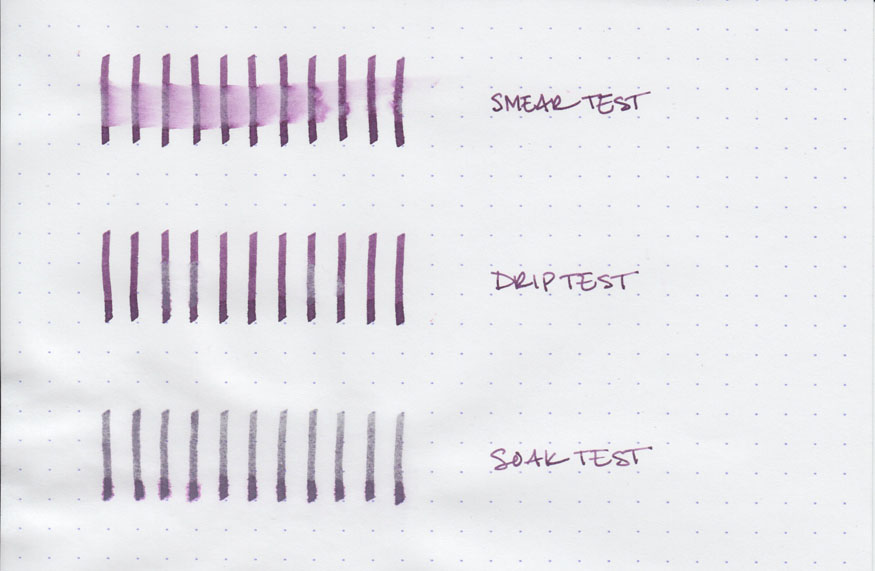
Pleasantly, the water tests revealed an unexpected level of water resistance. The smear test, in which I run a wet finger across the page, resulted in a vibrant purple smear, but left the lines still legible.
The drip test, in which I let drops of water sit on the page before blotting them, resulted in some ink being lifted and moderate feathering. However, it left the lines on the page intact. The soak test, in which I run the paper under a stream of water for half a minute, had the most surprising result: the water lightened the lines, but left them completely legible. I had no expectations of water resistance when I set out to test the ink, but I'm very pleased by what I found.

(click to embiggen)
De Atramentis inks come in 35ml glass bottles with plastic caps. The label on the bottles is semi-representative of the color of the ink contained within – Aubergine is fairly accurate, but I have heard that other colors are less so. The bottles themselves are functional and not unpleasant to look at, but don't rank among the sculptural achievements that contain Iroshizuku or Peklian Edelstein ink.
The vibrancy of Aubergine makes it ill suited to business use. While it is dark and saturated, it is quite clearly purple – and not a conservative purple like Diamine Damson or J. Herbin Poussiere de Lune. It is purple and there's no getting around it. For personal use, though, it's quite versatile – the color is luscious, but it's neither glaring nor obnoxious. It is easy to read and provides excellent contrast on bright white paper.
Aubergine is my first experience with De Atramentis ink, and I'm left with quite a positive impression. The quality of the color and the generally good behavior of the ink leave me wanting more. I'm excited to try out lots of the lovely colors that De Atramentis has available.
Review notes: To write the name of the ink, I used Pilot Parallel calligraphy pens with 3.8mm and 6.0mm steel nibs. A Lamy Joy calligraphy pen fitted with a 1.9mm steel nib created the medium-width lines. I used my Visconti Homo Sapiens with an EF palladium nib to create the fine lines on the page. The paper is bright white 80gsm from a Rhodia Bloc pad. The featured script is flourished italic.