ink reviews

ink review: sailor jentle blue black

(click to embiggen)

Sailor Jentle Blue Black is a very pleasant, easy to use, blue-black ink. It is a dark blue with tinges of black - exactly what I would expect from a blue-black ink, and exactly unlike the Parker Quink Blue Black I reviewed previously. It is a moderately wet ink, compared to the Parker Quink, and therefore writes with a bolder line. It is highly saturated and exhibits a medium level of shading in a fine-nibbed pen.

As with all of my recent reviews, I tested the ink on a variety of paper using a fine-nib: cheap office copier paper, Staples bagasse, an Ecosystem notebook, and the high-quality Rhodia webbie. On all of the paper, the ink performed equally well.

I noticed no feathering on any of the samples, which impressed me right off the bat. The ink is dark and saturated, so I did notice a medium level of show-through across the board, and no bleed-through on any of the samples except for a very minor amount on the cheap copier paper.

Dry time faired quite well compared to other inks, as well. On the copier paper and Ecosystem notebook, it was dry to the touch in three seconds. On the bagasse, it dried in eight seconds, and on the Rhodia in ten.

My only complaint about the ink is that it has a very sharp chemical solvent smell to it. Some inks possess a mild odor that is only noticeable up close, but this scent is more powerful. It is similar to the smell of some permanent markers. If you're sensitive to odors in general, or specifically to that type of scent, I'd recommend steering clear, or at least evaluating it in person before buying.


(click to embiggen)

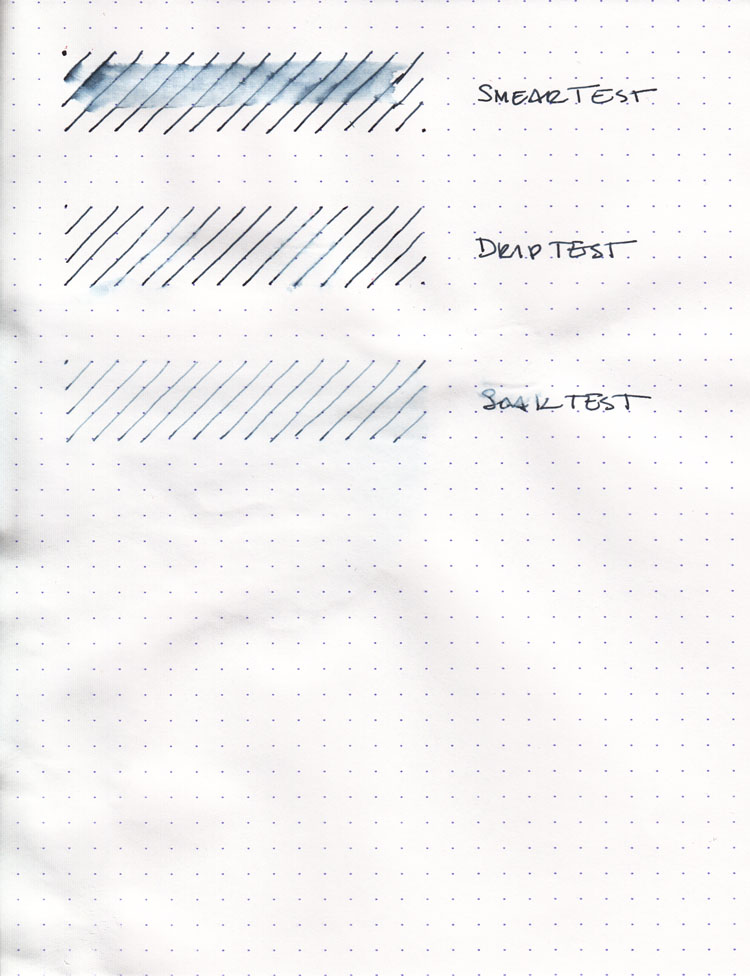
Sailor Blue Black did better than I expected on the water tests. It showed the worst behavior on the smear test, in which I dragged a wet finger across the page and got a nice blue-black smear for my effort. While the lines on the page were not destroyed, the smeared ink is dark and saturated enough to make it hard to read.

On the drip test, in which I let droplets of water soak on the page for a minute before blotting, I noticed a lightening of the lines on the page, but that was all. They remained fully legible. The soak test, in which I run the paper under a faucet for a minute, resulted in similar behavior. The lines lightened as the surface ink was washed away, but what remained was entirely intelligible.

My conclusion is that Sailor Jentle Blue Black has an appreciable degree of water resistance. You're unlikely to lose your work if it gets wet, though it might not be as pleasant to read as if it hadn't.


(click to embiggen)

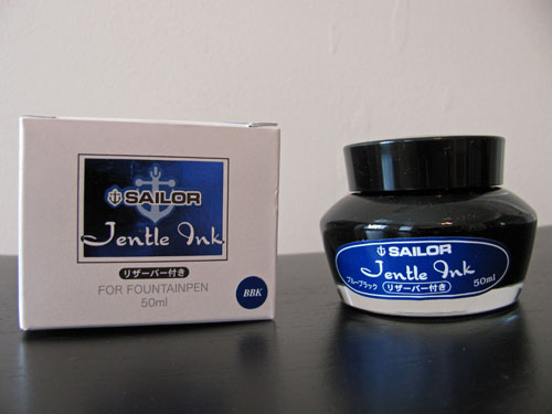
Sailor inks come in a bottle that looks like a cold-cream jar – though I suspect the water-resistant blue-black ink would make a poor cosmetic substitute for anyone but zombies. More interesting, perhaps, than the bottle's outward appearance, though, is the mechanism it has built-in for facilitating the filling of pens.

A plastic funnel of sorts sits inside the bottle. Prior to filling a pen, turn the bottle upside down (leave the lid on for this step, of course), and ink will fill the funnel. Then turn the bottle back over, and the ink will remain in the funnel for long enough to allow you to easily fill the pen. This is especially handy once the ink falls below a certain level in the bottle; it makes it very easy to get to every last drop.

As with most blue-black inks, Sailor Jentle is tailor-made for business use. It's a conservative color, provides very good contrast on the page, and is generally well behaved. It's an ink that would also work well for journaling or correspondence, and, aside from the previously mentioned odor, one I have no qualms recommending.

Review materials: For the wide strokes, I used three calligraphy pens: Pilot Parallel 6.0mm and 3.8mm pens, and a 2.0mm Pelikan Script. All three have steel nibs. For the fine strokes, I used a TWSBI EF steel nib on a TWSBI Diamond 530. The paper is Rhodia 80g from a No. 18 notepad.

ink review: noodler's dragon's napalm

(click to embiggen)

If you want to get someone's attention, send them a letter written in Noodler's Dragon's Napalm ink. It's the perfect ink for the task, as it is very close to the color of safety orange – that attention-getting hue that adorns traffic cones, the tips of toy guns, hunting caps, inmate jumpsuits, and the official state fungus of Ohio – the orange barrel.

It's a vibrant, highly saturated, ink that produces a bright, solid line in a fine-nibbed pen. In a broad-nibbed pen, though, it shades to a deep orange red, and it takes on a slightly pink tinge when under the right light. Speaking of shading, according to the manufacturer, it is the only "sepia-shading carmine" in the history of inks. What does this mean? 

Carmine is a bright red color and sepia is a dark brown-grey, but this ink doesn't seem to me like a combination of the two. The carmine pokes its head out in areas of heavy shading, but the sepia reference isn't obvious. A little paper chromatography, though, draws out a yellow-brown that underlies the color. Without it, Dragon's Napalm wouldn't have the same depth of character.

I tested Dragon's Napalm on four different papers using an extra fine nib: cheap, office-grade copier paper; Staples "Sustainable Earth" bagasse, an Ecosystem author notebook, and a Rhodia webbie. Feathering and dry time varied quite significantly across the different types of paper. 

On the cheap copier paper, it behaved acceptably, though not optimally. It displayed moderate feathering, significant show-through, and minor levels of bleed-through. Dry time was 3 seconds. On the bagasse, by contrast, it exhibited severe feathering, significant show-through and bleed-through, and took 8 seconds to dry to the touch.

On the Ecosystem's New Leaf paper, Noodler's Dragon's Napalm performed the best. It exhibited a low level of feathering, a low level of show-through, no bleed-through, and dried in 6 seconds. It's been my experience that Ecosystem's notebooks and Noodler's inks complement each other extremely well, and this is no exception.

With a few exceptions, Noodler's inks also tend to behave in a specific fashion with the fountain-pen friendly Rhodia paper, and Dragon's Napalm remains consistent. I found no feathering, no bleed-through, and a low level of show-through. On the other hand, the drying time was over 1 minute. It's a shame that so many of the Noodler's inks I've tried take so long to dry on Rhodia paper, since they otherwise behave so well.


(click to embiggen)

Dragons are known to the western world as fearsome, fire-breathing creatures that will engulf entire cities in flame to ensure that their snacks of medieval peasants are cooked to perfection. However, this particular dragon's fire can be easily quenched by a little bit of water; it did not hold up well on any of the water tests. The smear test, in which I run a wet finger across the page, resulted in a lovely neon orange smudge, but no trace of the underlying lines.

The drip test, in which I let several droplets of water soak on the page before blotting, resulted in the ink being lifted almost entirely from the page; only a hint of the original lines remained. Similarly, the soak test, in which I run the paper under a stream of water, washed the ink away quite effectively. It's an attention-getting ink, to be sure, but not one which you'd want to use in any water-sensitive situations.


(click to embiggen)

Noodler's Dragon's Napalm comes in a standard 3 oz. Noodler's bottle that's filled to the brim – so be careful when opening. Noodler’s intentionally uses stock bottles and lids to keep their prices low, which means that they aren’t intended to be show pieces in and of themselves. They are functional and stable, but not objets d'art intended for the top of one's desk.

I don't think anyone is going to mistakenly use Noodler's Dragon's Napalm to draft a legal brief or sign a contract, but it would be appropriate for proofing a paper or otherwise dramatically calling attention to something. It's a bit bright for journaling, I would suspect – certainly to my eyes, page after page of it would quickly become too much of a good thing. However, I could see it being used to jot a quick note or, more likely – in artwork or calligraphy.

Dragon's Napalm is an extremely vibrant ink that extremely vibrant people will likely get a kick out of. It behaves well enough on higher quality paper for me to recommend it to those who are looking for a very bold orange ink.

Note on images: this ink is devilishly difficult to scan correctly. I've attempted to correct the writing sample to get as close as possible. The sample as presented is slightly more red than in real life, and some of the shading detail has been lost.

Review notes: I used a 6.0 mm Pilot Parallel calligraphy pen for the widest strokes, a 2.0 mm Pelikan Script calligraphy pen for the medium strokes, and an extra-fine steel nib on a Lamy Safai for the fine strokes. The paper is Rhodia 80gsm from a No. 18 pad.

ink review: noodler's black swan in english roses

(click to embiggen)

Noodler's has released the second in its line of inks that have been designed for flex nib pens. The high-shading Black Swan in English Roses continues the high level of quality set by its predecessor. In my review of Black Swan in Australian Roses, I praised the ink's poetic nature, and English Roses delivers a similarly lyrical experience.

Where Australian Roses was violet-black with pink undertones, English Roses is an earthy red-brown with bright, poppy red undertones that peek out from time to time. It is a wonderfully deep, rich, and rewarding ink to work with.

(Flex nib sample written with a Noodler's Flex Nib pen. Click to embiggen.)

This ink is definitely designed for a wet-writing pen. In my TWSBI Diamond 530 with an extra-fine nib, it felt a bit dry and produced a very narrow line. However, it behaves exactly the way I want it to in my Pilot Falcon with a soft-medium nib. The Pilot is a very wet writer, and even inks like Diamine, which are in the midrange of "wetness," produce too great a flow for my tastes. English Roses, on the other hand, is exactly right – I can use it on the ultra-thin paper of a Moleskine cahier without any bleed-through whatsoever, and it produces dramatic and lovely shading.

I tested English Roses on five different papers using a fine nib: cheap, office-grade copier paper; Staples "Sustainable Earth" bagasse, a Moleskine lined notebook, an Ecosystem author notebook, and a Rhodia webbie. On every single paper, the ink behaved exceptionally well, exhibiting no bleed-though, no discernable feathering, and low levels of show-through.

Drying time ranged from a low of 4 second on the absorbent paper of the Ecosystem, to 6 seconds on the copier paper and the bagasse, to 12 seconds on the Rhodia, to a high of 20 seconds on the Moleskine.

(click to embiggen)

Like Australian Roses, English Roses is partially water resistant. The smear test, in which I run a wet finger across the page, created a red streak, but the lines remained intact and are still mostly legible. The drip test, in which I let droplets of water sit on the paper for a minute before blotting, resulted in the red dye being lifted, but the darker brown dye remained on the page.

The soak test, in which I run the paper under a faucet, resulted in the complete washing away of the red dye (it left a red haze on the page), but left the brown parts of the ink intact. It was fully readable even after a full soak. In my opinion, it is not an ink that you could put down and then paint or wash over, but an envelope addressed with it should have no trouble arriving at its destination.

(click to embiggen)

Noodler's Black Swan in English Roses comes in a standard 3 oz. Noodler's bottle that's filled to the brim – so be careful when opening. Noodler’s intentionally uses stock bottles and lids to keep their prices low, which means that they aren’t intended to be show pieces in and of themselves. They are functional and stable, but not an objet d'art intended for the top of one's desk.

English Roses is another amazing ink in the Black Swan series. To get the full value from it, you'll need to use it with a wet-writing or flex nib, but it performs admirably under these circumstances. It will still perform quite well in a drier nib, but you won't quite get the same level of dramatic intrigue out of it. I continue to be impressed by the dry time, performance, and beauty of the Black Swan series, and I hope that further entries await us.

Review notes: I used a 3.8 mm Pilot Parallel calligraphy pen for the widest strokes, a 2.0 mm Pelikan Script calligraphy pen for the medium strokes, and an extra-fine steel nib on a Lamy Safai for the thin stroke. The paper is Rhodia 80gsm from a No. 18 pad.

Noodler's Black Swan in English Roses is available from:

ink review: parker quink blue black

(click to embiggen)

Parker Quink Permanent Blue Black is a workhorse of an ink that I'm sorry I waited this long to try out. First developed in the late 1920's, it was regarded as a revolutionary ink that eliminated the need for blotting. It remains, to this day, one of the most popular fountain pen inks in production.

Parker's version of blue-black is moderately saturated and allows for a modicum of shading in a fine nib. It is not the color I think of when I think of blue-black, however. I see it as more of a medium teal-blue. On ivory or off-white paper, the teal tones show through even more prominently than on white paper. It is also a bit of a dry writer. On each paper, the nibs I tested wrote true to size, if not slightly smaller.

Blue-black is the first Parker Quink (a portmanteau of "quick" and "ink") in my collection, and I now understand why it is so popular. It is one of the best behaving inks I've ever used. I tested it on five different papers: cheap copier paper, Staples "Sustainable Earth" bagasse, a Moleskine notebook, an Ecosystem notebook, and a Rhodia webbie.

On every single paper I tested, I saw no trace of feathering, a low level of show-through, and no bleed-through at all. Drying times varied a bit – from 3 seconds on the copier paper; to 8 seconds on the bagasse, Moleskine, and Ecosystem; to 12 seconds on the Rhodia – but they all fell well within the normal range for each paper.

(click to embiggen)

For an ink labeled as permanent, though, it is anything but waterproof. The smear test, in which I drag a wet finger across the page, produced a lovely teal smudge which obliterated any trace of the underlying line. The drip test, in which I let a drop of water sit on the paper for a minute before blotting, lifted a significant amount of ink from the page.

The soak test, in which I run the paper under a stream of water, washed away nearly all the ink. The faintest trace of a line was left – the ghost of inks past, I suppose – but not enough to be legible. To be fair, the "permanent" label exists only to contrast with the "washable" label of their blue ink, which is specifically designed to be easily removed from one's hands. Still, I wouldn't address an envelope with it, especially if one's destination is in Atlantis.

(click to embiggen)

Parker Quink comes in a solid, sturdy 2 oz. bottle, which is a perfectly pleasant. It's neither ugly nor utilitarian, but it is a bit conservative, as befits the ink it holds. It won't look out of place on the desk of anyone that wears a Brooks Brothers' suit to work (present company included), but it might seem a tad archaic on the shelf of a modern, bohemian artist.

I suspect that the primary audience for Parker Quink Blue Black is business, as it is a slightly conservative ink that is designed to be used all day, every day. It is also perfectly acceptable for personal correspondence and journaling, as it is easy to read and easy to use on a wide variety of paper. It will write anywhere with nary an objection, and it rinses out of pens without any issues.

Parker Quink Blue Black is a solid ink that is a tremendous value for the price. If you're looking for an inexpensive, well-behaved, daily use ink, then this is an excellent candidate. If you're looking for something flashy or bold, then look elsewhere.

Review materials: For the wide strokes, I used three calligraphy pens: Pilot Parallel 6.0mm and 3.8mm pens, and a 2.0mm Pelikan Script. All three have steel nibs. For the fine strokes, I used a TWSBI EF steel nib on a TWSBI Diamond 530. The paper is Rhodia 80g from a No. 18 notepad.

Parker Quink Blue Black is available from: