ink reviews

ink review: platinum carbon black

Rating: 4.5

(click to embiggen)

Traditional carbon inks were made with soot or lampblack mixed with gum arabic or another binder. The carbon particles would not fade over time, even when exposed to sunlight, and the ink was not harmful to paper. However, it was not waterproof, could smudge in humid environments, and was not at all fountain-pen friendly.

Platinum has re-engineered the carbon ink, though, to solve all of those problems. Their Carbon Black ink is a waterproof, pigment-based, archival quality fountain pen ink. For those unfamiliar with pigment-based inks, they differ from traditional dye-based inks in that they are made by suspending micro-particles in solution. They are specifically formulated for fountain pens, with particles small enough and binders benign enough that they won't clog the feed or interfere with the capillary action of the nib during normal use.

From what I can discern, though, the nature of a pigment based ink does call for a vigilant level of pen hygiene. It is always a good idea to flush one's pen with water when switching between inks and between every few fills when sticking with the same ink – and it's essential when using this ink. Additionally, you should definitely flush this ink from a pen if you're going to leave it for more than a week without use – it will make the pen very difficult, if not impossible, to clean if it dries in the pen.

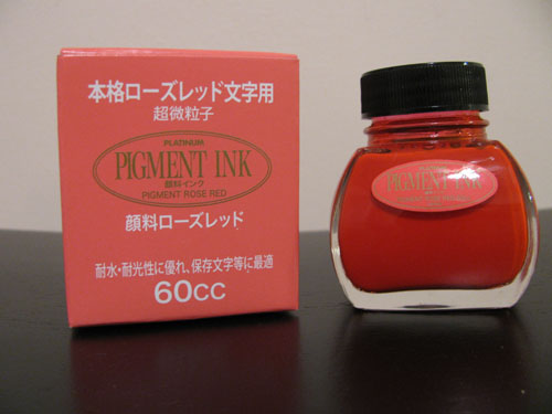
Unlike the Platinum Pigment Rose Red ink, which I have previously reviewed, I have noticed that the Carbon ink has a slight tendency to stain converters – bestowing a slightly smoky finish on the clear plastic – much like Noodler's Black does. Therefore, I wouldn't recommend it for a clear demonstrator, but it should be fine for most other pens. It appears to be otherwise safe if sensible precautions are followed.

Carbon produces a solid black line in both an extra fine nib and a wide calligraphy nib. It is highly saturated and offers no shading. Nor does it possess any sort of tint – there are no blues or reds or greens hiding underneath. It's soot black.

It was well behaved on each of the papers that I tested it with. I saw no feathering on any paper, from Rhodia to Ecosystem to standard copier paper to ultra-thin bagasse. I saw moderate show-through on thinner papers – it is a fairly dark ink – but low to no bleed-through.

Drying time was also fairly good, ranging from 2 seconds on copier paper to 8 seconds on the normally long-drying Rhodia paper. The ink flowed nicely, and produced a line true to width – being neither particularly wet nor particularly dry.

(click to embiggen)

One of the selling points for carbon and other pigmented inks is their water resistance. Some bulletproof, dye-based inks, like Noodler's, bind to the cellulose in the paper, but any ink left to dry on the surface can wash away or smear when exposed to water. This makes them great for signing checks, but poor candidates for artists that want to apply a wash over them. Platinum Carbon Black, on the other hand, dries like paint. This makes them ideal for artists who want to work with mixed media.

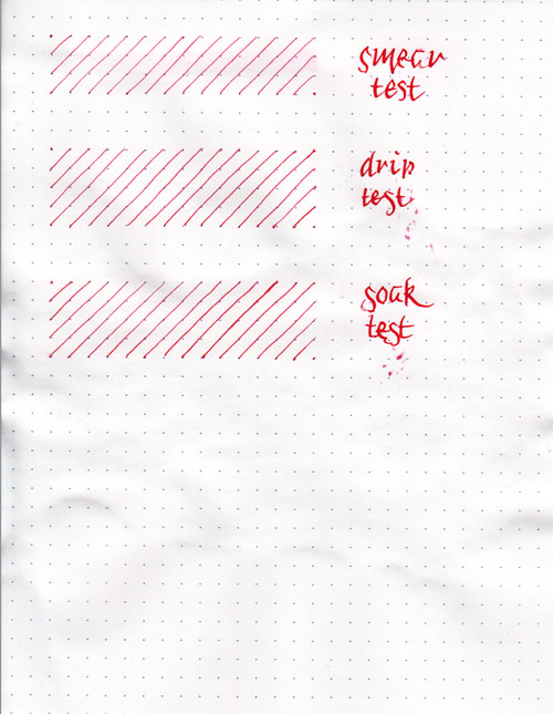
The smear test, in which I run a wet finger over the paper, reveals that the ink can be smudged with a bit of effort. If you look close, you can see a fine light-grey tint to the paper where I dragged it across the lines. On the other hand, the drip test, in which I let droplets of water settle on the page before blotting them up, and the soak test, in which I run the paper under the faucet for a minute, show that the ink hasn't moved one bit. It doesn't look like it got water near it at all – a major difference from most dye-based inks.

In the visual example above, I was able to draw an illuminated letter "C" with the carbon ink and then paint over it with thinned acrylic paint without smudging it at all. I had no trouble with it affecting the color of the paint in any way. It seems to be quite artistically friendly in this regard.

(click to embiggen)

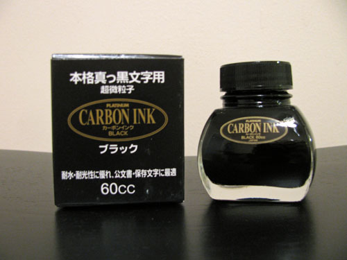
Platinum Carbon comes in a clear, 60ml bottle that definitely shows off the solid black ink. In the bottle, it looks exactly like it does on paper. The thick bottomed bottle would look equally at home on an artist's shelf as on top of one's desk.

Black inks are a staple of the business world, and Carbon Black is a great option. It produces a solid line and is easy to read on any paper. Its waterproof nature makes this a great signature ink, and it is very artistically friendly. It's also great for calligraphy – it makes blackletter scripts look fantastic.

I'm not a frequent user of black ink, but Platinum Carbon Black has edged out Noodler's Black as my reference black. I can easily recommend it for those that prefer a dark, black ink, and for those that are using it to create art.

Review materials: For the wide strokes, I used Pilot Parallel 6.0mm and 3.8mm calligraphy pens. They both have steel nibs. For the fine strokes, I used a Lamy EF steel nib on a Lamy Safari. The illuminated letter was outlined with a Lamy EF nib and then painted over with acrylic paints and a brush. The paper is Rhodia 80g.

Platinum Carbon Black is available from:

ink review: noodler's baystate blue

Rating: 3.0
February 22, 2011

(click to embiggen)

My first thought, upon opening the bottle of Noodler's Baystate Blue, was "Holy cats, that's blue." It is not a subtle ink. Rather, it is an electric cobalt blue that positively jumps off the page. It's highly saturated, as many Noodler's inks tend to be, and it exhibits no shading. It simply lays down a solid, bright, blue line.

Baystate Blue has generated a bit of controversy lately. Some people absolutely hate this ink, claiming that it behaves poorly, stains everything in sight, and ruins fountain pens forever. In response, Nathan Tardiff, the wizard behind the Noodler's curtain, posted a video defending the behavior of Baystate Blue. In the video, he demonstrates no feathering or bleed-through on cheap copier paper. With all due respect to Mr. Tardiff, his paper is not my paper. In my testing, the behavior of this ink is all over the board.

I tested this ink on five different papers using the same pen, a Lamy Safari with an EF steel nib. On cheap copier paper, I saw moderate feathering, moderate bleed-through, and significant show through. On the other hand, it was dry to the touch in 2 seconds.

On bagasse paper from Staples (their Sustainable Earth notepads), the feathering, show-through, and bleed-through were worse than the copier paper, though the dry time remained the same. For comparison's sake, Noodler's Kung-Te Cheng performed significantly better, with almost no feathering in a similar pen.

In a Moleskine journal, I saw no feathering, but did notice significant show-through and bleed-through. Dry time was about 10 to 12 seconds. On Rhodia paper, as I expected, I saw no feathering at all, moderate show-through, and no bleed-through – but it took over a minute to dry to the touch.

Baystate Blue performed best on the absorbent paper of an Ecosystem author journal, which is unsurprising given the other Noodler's inks I've tested. There was a very low level of feathering, only moderate show-through, and no bleed-through that I could discern. It dried in four seconds.

In addition to performance, there are a few other things to consider when it comes to Baystate Blue. First, it will stain absolutely anything and everything it touches, and it does so with a vengeance, as though it is personally offended that any other color is present on your kitchen counter, your stainless steel sink, your clothing, or your skin. You, me, and everything else is clearly too polychromatic for its tastes, and it will never stop until the world is transformed into a solid sea of cobalt blue.

Noodler's themselves warn against using any of the Baystate line of inks if you are uncomfortable with the possibility of permanently altering the color scheme of your kitchen. They are not kidding.

Second, it can and will actively stain the plastic parts of a pen, though a solution of bleach and water will apparently remove most of the color from plastic; it is not an easy ink to clean out of a pen. Third, Noodler's indicates that Baystate Blue should not be mixed with other inks except for those in the Baystate line, as the pH value is more alkaline than other inks in the Noodler's line.

Rhodia (click to embiggen)

Copier paper (click to embiggen)

This ink is marketed as being waterproof, and here, once again, my results varied depending on the paper. I used both the coated paper of a Rhodia Dot Pad and the absorbent paper taken from my home office laser printer. From what I can discern, only the ink that gets absorbed by the paper can be considered water-fast. By definition, the coated Rhodia paper absorbs far less ink than the printer paper, and consequently shows much worse behavior.

The smear test, in which I rub a wet finger across the page, results in a bright blue smear on the Rhodia. On the copier paper, it creates a light blue tint in the affected area. The drop test fared better on the copier paper – no ink came up there, but it did lift from the paper on the Rhodia paper.

The soak test, in which I run the paper under a stream of water, resulted in a blurry blue mess on the Rhodia paper, though, to be fair, the lines are all still discernable. On the copier paper, I once again saw a light blue tint, but the ink did not otherwise move.

So is it waterproof? Well, yes. You won't lose your work if you drop your notebook into the ocean and then jump in to recover it. However, it won't be pretty to read once you've managed to dry it out. If you're concerned about full water resistance, I'd point you to other Noodler's inks that perform better across all paper types, or the Platinum line of pigment inks.

(click to embiggen)

Noodler's inks come in a standard 3 oz. bottle that's filled to the brim – so be careful when opening (especially this one). Noodler’s intentionally uses stock bottles and lids to keep their prices low, which means that they aren’t intended to be show pieces in and of themselves. They are functional and stable, but not an objet d'art intended for the top of one's desk.

In the video mentioned earlier, the good Mr. Tardiff mentions that Baystate Blue provides the greatest level of contrast of any ink on the market, and I find it hard to disagree. However, depending on your tastes, that level of contrast might not be for you. I find it easy to pick out on the page, certainly, but I think pages upon pages of it would drive me nuts. That's an aesthetic preference, though – I could easily see someone falling in deep, cobalt blue love.

I normally consider Noodler's inks to be great on cheap paper and unpleasant on good paper, but this one has me confounded. On office-grade copier paper, it performed tolerably.  On thicker absorbent paper like that of an Ecosystem journal, it performed admirably. On the cheap bagasse paper it was a mess, and it took far too long to dry on Rhodia paper, where it, of course, looked the best.

I can hesitantly recommend it for those that use a better grade of copier paper than my office does, or for those that use Ecosystem journals. I would suggest giving it a pass for those dedicated to their Rhodia pads, or for those that use cheap, thin notepaper.

Review materials: For the wide strokes, I used three calligraphy pens: Pilot Parallel 6.0mm and 3.8mm pens, and a 1.9 mm Lamy Joy. All three have steel nibs. For the fine strokes, I used a Lamy EF steel nib on a Lamy Safari. The paper is Rhodia 80g.

Noodler's Baystate Blue is available from:

ink review: platinum pigment rose red

Rating: 4.0

(click to embiggen)

Platinum Pigment Rose Red is my first experience with pigment-based fountain pen inks. The vast majority of fountain pen inks are dyes dissolved in water or other solvents, but pigment-based inks have micro-particles that are suspended in solution. They are specifically formulated for fountain pens, with particles small enough and solvents benign enough that they won't clog the feed or interfere with the capillary action of the nib.

From what I can discern, though, the nature of a pigment based ink does call for a vigilant level of pen hygiene. It is always a good idea to flush one's pen with water when switching between inks and between every few fills when sticking with the same ink – and it's essential when using this ink. Additionally, you should definitely flush this ink from a pen if you're going to leave it for more than a week without use – it will make the pen very difficult, if not impossible, to clean if it dries in the pen. That said, it appears to be safe if these normally sensible precautions are followed.

Rose Red is an ink with a low level of saturation and, in a fine nib, possesses a moderate degree of shading. In a calligraphy nib, though, the intensity of the ink corresponds directly to the wetness of the line – it ranges from a pale bubblegum pink to a juicy, ruby red grapefruit.

This ink behaved quite well on each of the papers I tested it with. I saw feathering on neither Rhodia paper, which I expected, as it tends to be feather-resistant, nor on the absorbent paper of an Ecosystem journal. Show-through was low, as it's a fairly light colored ink, and I noticed no bleed-through with any of the pen and paper combinations that I tested.

Dry time varied considerably, though. On Ecosystem paper, the ink was dry to the touch on six seconds. On Rhodia, which normally takes longer, it took about fifteen seconds – much too long for lefty-over-writers. For my habits, it's in the comfortable range.

(click to embiggen)

One of the selling points for pigment inks is their water resistance. Some bulletproof dye-based inks, like Noodler's, bind to the cellulose in the paper, but any ink left to dry on the surface can wash away or smear when exposed to water. This makes them great for signing checks, but poor candidates for artists that want to apply a wash over them. Platinum pigment inks, on the other hand, dry like paint. This makes them ideal for artists who want to work with mixed media.

The smear test, in which I run a wet finger over the paper, revels that the ink can be smudged with a bit of effort. If you look close, you can see a fine pink tint to the paper where I dragged it across the lines. On the other hand, the drip test, in which I let droplets of water settle on the page before blotting them up, and the soak test, in which I run the paper under the faucet for a minute, show that the ink hasn't moved at all. I was incredibly surprised! It doesn't look like I got water near it at all – a major difference from most dye-based inks.

In order to get the ink to leave the page, I actually had to get the paper wet, and then rub it hard enough to take a layer of paper up. Essentially, I had to destroy the paper to get the ink off. This certainly qualifies for the label of permanent for me – and I think it will certainly please those that are looking to use it for artistic purposes.

(click to embiggen)

Platinum Pigment inks come in a clear, 60ml bottle that definitely shows off the ink. Unlike many dye-based inks, which can look dark and uniform within the bottle, pigment inks are vibrant, and look exactly like their respective color on paper. The thick bottomed bottle would look equally at home on an artist's shelf as on top of one's desk.

Pink inks are likely even less business appropriate than red inks – even red ink finds a place in proofing. This ink is certainly not going to be the one to reverse that trend. For those considering using it for personal journaling or correspondence, I would look at the sample provided closely – the contrast isn't high enough in an EF nib to be comfortable for long periods of reading, in my opinion. For calligraphy or other artistic purposes, though, this is an amazing find – and is certainly where I see myself and others using it.

For my first experience with pigment-based inks, Platinum Pigment Rose Red left me satisfied. The color is far too pink and light for my everyday use, but it leaves me excited to try the other colors in the Platinum Pigment line. For those that like rose colored inks, this is definitely one to consider.

Review materials: For the wide strokes, I used three calligraphy pens: Pilot Parallel 6.0mm and 3.8mm pens, and a 1.9 mm Lamy Joy. All three have steel nibs. For the fine strokes, I used a Lamy EF steel nib on a Lamy Safari. The paper is Rhodia 80g.

Platinum Pigment Rose Red is available from:

ink review: diamine midnight

Rating: 4.5

(click to embiggen)

When I first put Diamine Midnight to paper, I thought to myself that it was a nice, but not particularly interesting dark blue ink. Then I looked closer, and closer, and closer – and got drawn right in. For those willing to pay attention, this ink has a wonderful sense of depth that captures the variability and mystery of the nighttime sky. In fact, in the more saturated sections, there's a hint of red that peeks out, giving it an almost sinister look. This is the dark blue of a steampunk starscape – of Victorian London, where Dracula and Jack the Ripper lurk in the shadows.

It is a moderately saturated dark blue with a hint of indigo. In a fine nib, it exhibits a modicum of shading – just enough to give it a rich, complex feel. In a calligraphy nib, one can see significant areas of high and low saturation, and a mysterious red border between the two. The color is not particularly affected by the color of the paper – on both the bright white Ecosystem and off-white Rhodia webbie, the color remained consistent.


Midnight is a well-behaving ink, a characteristic that I've found in each of the Diamine inks I've reviewed so far. On both absorbent paper, like Ecosystem, and resistant paper, like Rhodia, feathering was not noticeable. Show through was noticeable on thinner paper, like a Moleskine cahier, but otherwise very low. I noticed only one very minor issue of bleed-through with any of the paper and pen combinations – the 6mm Pilot Parallel calligraphy pen caused a tiny spec to peek through.

(click to embiggen)

As with the other Diamine inks I've reviewed, water resistance is not an included feature. The smear test, in which I rub a wet finger across the page, obscured the lines and left a blue smudge behind. The drip test, in which I let droplets of water sit on the page for about a minute before blotting them, left ghostly, pale blue impressions of the lines behind.

The soak test, in which I run the paper under a faucet for half a minute, did a great job of washing the ink right off the page. Midnight is not a waterproof ink – it doesn't even achieve the "addressing an envelope" level of resistance – so I'd recommend leaving it for journals or other things that have a low risk of encountering moisture.

(click to embiggen)

Diamine inks are available in a 30ml plastic bottle and an 80ml glass bottle, both of which are utilitarian in appearance. The smaller plastic bottle has a neck that is very small in diameter. I found that some of my larger pens, like a Lamy 2000, would not fit all the way in, which made getting to the ink a bit of a challenge. My recommendation would be to go for the larger bottle.

Blue inks are one of the mainstays of the corporate environment, and Midnight would fit in quite nicely. It's a dark blue that's easy to read on both ivory and white paper, and isn't bright enough to offend anyone's sensibilities. It is also a great choice for personal correspondence, having a nice, warm, rich tone. Finally, it's also a great candidate for calligraphy and other artistic endeavors – that mysterious red aura that it develops adds an unexpected depth of character to the work.

Diamine Midnight doesn't quite knock Noodler's Kung Te-Cheng out of the top spot on my list of blue inks, but I think it easily took second. If you like dark blue inks, this is an easy choice to add to your collection. Now I just have to buy an 80ml bottle to replace the sample I was sent in order to make sure I've got enough on hand to last a long time.

Review materials: For the wide strokes, I used two calligraphy pens: Pilot Parallel 6.0mm and 3.8mm pens. For the "by comparison" line, I used a Noodler's Creaper Flex Nib pen. All three have steel nibs. For the fine strokes, I used a Lamy EF steel nib on a Lamy Safari. The paper is Rhodia 80g.

Note on this review: a sample of this ink was provided for review purposes by Diamine Ink.

Diamine Midnight is available from: