ink reviews

ink review: everflo blue-black

Rating: 1.0

(click to embiggen)

After I've finished writing an ink review, I'm left with anywhere from four to six pens lying around with several milliliters of ink still in them. Typically, I empty the pens back into the ink bottle they came from, in order to save the ink for later. Occasionally, I like an ink enough that it stays in the pen I used to test it until I'm distracted by the next wonderful ink to cross my desk. More rarely, I'll be so crazy about an ink that it takes up near-permanent residence in my ink rotation: Noodler's Kung Te-Cheng, Diamine Imperial Purple, J. Herbin 1670. Everflo Blue-Black, on the other hand, is the first ink that went right down the drain.

Let's not get ahead of ourselves. Everflo is a new line of ink introduced by the Gate City Pen and Ink Company, a partnership established in 2010 between well-respected nibmeister Richard Binder and Jim Baer. Their stated purpose is to build vintage-style, handmade pens, and to offer ink with vintage behavior to match. However, I'd bet my trusty Lamy Safari that Everflo is actually produced by Noodler's Inks for Gate City. The bottles, caps, and even boxes are exactly the same as Noodler's Ink – even down to the marks on the bottom of the bottles.

The identity of the ink manufacturer is irrelevant, though, since, in my estimation, no one should want to claim credit for it. It is the singularly worst-behaving ink that I've ever had the displeasure of putting in a pen.

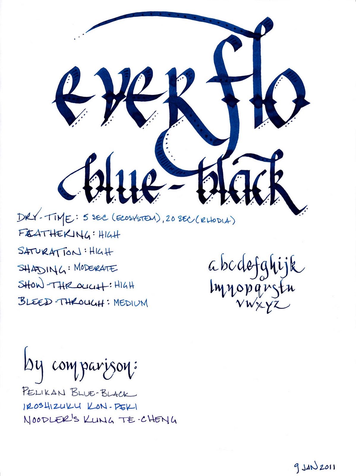
The color is probably the best quality of this ink. While named "blue-black," it is different than a traditional blue-black. This ink is a lovely, dark, saturated blue-green that develops a hint of black when used in a wet writing pen. In a dry writing pen, like the trusty Lamy Safari that I just put on the line, the "black" part of the blue-black is lost, but it nevertheless remains a lovely dark teal. It provides for moderate shading, though this is most evident in a wet writer. In a dry writer, it is much more consistent.

I also give the ink credit for being well-lubricated. It does help the pen glide nicely across the page. It's too bad that the interaction with said page is where things go all pear-shaped.

When I first got this ink, I decided to load it into my Pilot Falcon with a soft-medium nib. It is one of my wettest writers, and when I put ink to paper, I thought that it might be the culprit for the heavy feathering, significant show-though, and noticeable bleed-through that plagued every paper I tried. However, even when I switched to my Lamy Safari with an EF nib, the problems remained.

I tested with both pens on Rhodia, Moleskine, and Ecosystem paper. Rhodia was the best behaved, as expected, with no feathering as a result of either pen. However, I noticed significant show-through with both pens. I also noticed significant bleed-through with my Noodler's Creaper flex nib pen, and with my Pilot Parallel calligraphy pens. Even a fine line took upwards of twenty seconds to dry.

Moleskine was, by far, the worst performer. Both pens made a mess of the paper – with extreme amounts of feathering and show-through, and significant bleed-through. Drying time with the Safari was in the twelve to fifteen second range. The absorbent paper of the Ecosystem notebook reduced the drying time to five seconds, which is manageable, but suffered from noticeable feathering and show-through, and even a bit of bleed-through from both pens.

(click to embiggen)

Water resistance is intentionally absent, as Everflo inks are designed to be washable. The smear test, in which I ran a wet finger across the page, left an illegible blue streak. The drip test, in which I let a drop of water sit for a minute before blotting it, raised nearly all of the ink from the page. The soak test, in which I run the paper under a stream of water, was quite effective in eliminating almost any trace of the ink. Pleasantly, the ink washed right out of my pens, as well, leaving no trace behind.

(click to embiggen)

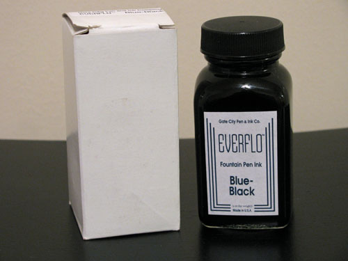
As mentioned earlier, Everflo comes in bottles that are suspiciously identical to those used by Noodler's. They're also filled nearly to the brim, just like Noodler's. They're also about as unlikely to grace the top of your desk, just like Noodler's. They do an admirable job of keeping the ink in the bottle, though, which is precisely where this particular one should stay.

I can't, in good conscience, recommend this ink to anyone. It's a lovely color, to be sure, and it provides a nice level of lubrication to even the narrowest of pen nibs. But that's about all. There are hundreds of much better behaved inks out there that are just as lovely, and each one of them deserves more attention than this one. I'm hoping I get better results from the bottle of Everflo Orchid I ordered at the same time, but I'm not feeling optimistic.

Review Notes: I used a Pilot Falcon with a gold SM nib and a Lamy Safari with a steel EF nib for the fine lines. I used a Noodler's Creaper with flex nib for the flex samples. For the wide strokes, I used Pilot Parallel 6.0mm and 3.8mm pens with steel nibs. The paper is Rhodia 80gsm.

Retailer Note: In the USA, Everflo is currently available only from Richard Binder's website and the Goulet Pen Company, where I ordered my bottles. You shouldn't hold this ink against them – Brian Goulet is a great retailer who loves fountain pens and loves his customers even more. He's always great to work with and puts in extra effort to make sure all of his orders ship on time and arrive in good condition. Them, I'll recommend.

ink review: j. herbin terre de feu

Rating: 4.0

(click to embiggen)

If J Herbin Café des Isles is the color of coffee with cream, then Terre de Feu is the color of powdered cocoa. It is a lovely milk-chocolate ink with a slight reddish undertone – almost reminiscent of red clay. It possesses a low degree of saturation and a high degree of shading in even a fine nib pen.

As with most J Herbin inks, Terre de Feu is slightly watery – as a result, it flows easily, but does not provide significant level of lubrication between pen and paper. It is well-behaved in other respects, though. It exhibits a low level of show-through and no bleed-through at all on each of the papers I tested it against.

Dry time was average. On the slow-drying and non-absorbent Rhodia paper, it took 5 seconds to dry to the touch. On the absorbent and typically fast-drying Ecosystem paper, it took slightly longer, at 6 to 8 seconds. I've seen this behavior with occasional inks, and it always startles me. Feathering was atypically low for J Herbin inks on both papers, which is nice to see.

(click to embiggen)

Water resistance was generally low. In the smear test, in which I run a wet finger across the page, the red-brown dyes ran easily, creating a lovely smudge on the page. The drip test, in which I let several drops of water soak into the page for a minute before blotting them up, pulled the red-brown dye right off the paper, leaving a ghostly grey line behind.

The results of the soak test, in which I run the paper under a stream of water for thirty seconds, were better than I anticipated. While the red-brown dye washed off almost immediately, it left behind a light grey line that is similar to a pencil line. As a result, a catastrophic encounter with water might not completely obliterate one's work. However, I wouldn't use Terre de Feu with anything I intended to resist the elements, like the outside of an envelope.

(click to embiggen)

J. Herbin fountain pen inks come in a 30ml bottle with an integrated pen rest that is suitable for displaying on top of one's desk.

Brown inks are a versatile lot. It is a relatively conservative color, so one could quite likely use it for business purposes. It reads easily on white and off-white paper, and therefore works well for journaling or personal correspondence. This ink, in particular, is lovely for calligraphy and other artistic endeavors, with a rich, earthy character hiding under its surface.

I like J Herbin Terre de Feu more than Café des Isles. It is a versatile ink that walks the line between conservative and bold, and the red undertones are evocative and lovely. While the water resistance is low, it is otherwise a delightful ink to use, and, for those that like brown ink, is a worthwhile addition to your collection.

Review materials: For the wide strokes, I used a Lamy 1.1mm steel calligraphy nib in a Lamy Safari. For the narrow strokes, I used an EF steel nib in a Lamy Safari. The paper is Rhodia 80gsm from a No. 16 Bloc Pad.

ink review: diamine monaco red

Rating: 4.5

(click to embiggen)

Monaco Red is another great red ink from Diamine. It's an earthy, orange red with brick undertones – very reminiscent of J Herbin 1670. It is less blue than Diamine Red Dragon and less brown than Diamine Oxblood. According to at least one source, this ink was formulated by Diamine at the special request of the Crown Prince of Monaco. I presume the ink was engineered to match the red in the Monegasque flag and coat of arms.

It is a saturated red that exhibits a moderate level of shading in a fine nib and a superb level of shading in a wide or wet nib. The color is not dramatically affected by the color of the paper – on both white and ivory Rhodia paper, the ink appears nearly the same. It is also well-behaved on each paper I used to test it. Show-through was low, overall, and bleed-through only occurred on the very thin paper of a Moleskine cahier – and that was minimal.

Diamine Monaco Red provides a nice level of lubrication, allowing an extra-fine nib to glide easily across the page. Drying time is quick as well – only 8 seconds on the normally long-drying Rhodia paper and 4 seconds on the absorbent paper of an Ecosystem journal.

(click to embiggen)

Water resistance is, to my mind, the singular issue with this ink. A smear test, in which I ran a wet finger across the page, did a great job of obliterating the lines and creating a red mess.

A drip test, in which I let drops of water set for about a minute before blotting them, was even worse. The ink came up almost entirely from the areas where the water touched the paper. Worst of all, though, was the soak test, where I run the paper under a stream of water. The ink jumped off the page so quickly, I would have suspected that it was allergic to it. Perhaps they offended each other. Either way, it came up so easily that I cut the test short after only a few seconds.

(click to embiggen)

Diamine inks are available in a 30ml plastic bottle, which is utilitarian in appearance, and an 80ml glass bottle, which is slightly less so. The smaller plastic bottle has a neck that is very small in diameter. I found that some of my larger pens, like a Lamy 2000, would not fit all the way in, which made getting to the ink a bit of a challenge. My recommendation would be to go for the larger bottle.

Red inks are not traditionally workplace appropriate, though I have no qualms about using them. Most, however, would find Monaco Red to be no exception – unless you happen to be the Crown Prince of Monaco, I suppose – and then who's going to stop you anyway? It's good to be the king, no? At any rate, this ink is easy to read, to my eyes – not too bold and not too light – and therefore good for journaling and other personal use.

I continue to be impressed by Diamine, and Monaco Red is an impressive ink. I'm happy I bought the large 80ml bottle – I can see this making its way into my standard repertoire for everyday use and for calligraphy. If you, like me, enjoy red inks, then I will not hesitate to recommend adding it to your collection.

Review materials: For the wide strokes, I used three calligraphy pens: Pilot Parallel 6.0mm and 3.8mm pens, and a 1.9 mm Lamy Joy. All three have steel nibs. For the fine strokes, I used a Lamy EF steel nib on a Lamy Safari. The paper is Rhodia 80g.

ink review: diamine sepia

Rating: 4.0

diamine sepia

Diamine Sepia is a wonderful fall color, reminding me of golden fields of wheat that sway in the wind of a cool November day. It is a golden-brown ink with a low level of saturation and an amazing ability to produce beautiful shading. While the color of some inks varies with the shade of paper, Sepia is consistent, appearing just slightly darker on the off-white paper of a Moleskine journal than on the bright-white paper of a Rhodia pad. 

Like other Diamine inks I have reviewed, Sepia behaves nicely on a wide variety of paper. Even with the fine-medium nib on a Noodler's pen, which lays down a thicker line than my EF nibs on my Lamy Safari pens, I noticed no bleed through and very little show-through on Moleskine journal paper.

The drying time for this ink was also very friendly. On the typically long drying Rhodia paper, Sepia took ten seconds to dry to the touch. On an absorbent paper, like standard copier paper, it took four seconds to dry, which should make it a good choice for left-handed over-writers. I also noticed no special tendency to feather on any of the paper I tested it on.


Where Sepia falters, for those who are concerned about such things, is in its resistance to water. For the smear test, I dragged a wet finger across the page, which did a good job of leaving a golden smear and obliterating most of the lines. For the drip test, I let droplets of water stand for about a minute before blotting them up. The water did an effective job of pulling the ink from the paper.

The last test, the soak test, was conducted by running the paper under the faucet for about five seconds. In that time, the vast majority of the ink had washed away. If I'd kept going, I could have easily washed it completely off. As an ink, it's not suitable for addressing envelopes, and I'd refrain from writing out recipes using this ink, if your cookbook is as sauce-stained as mine.


Diamine inks are available in a 30ml plastic bottle and an 80ml glass bottle, both of which are utilitarian in appearance. The smaller plastic bottle has a neck that is very small in diameter. I found that some of my larger pens, like a Lamy 2000, would not fit all the way in, which made getting to the ink a bit of a challenge. My recommendation would be to go for the larger bottle.

Diamine Sepia is a very pretty ink and well behaved. While I don't make much use of brown inks, personally, I can see this being very appealing to those that like do. I plan on using it any time I need a "vintage" or faded look for a calligraphy project.  I've had good experiences with all of the Diamine inks I've reviewed so far, so I don't hesitate to recommend it to those that are looking for a harvest gold color.

Review Notes: for the wide strokes, I used a Lamy 1.9mm steel calligraphy nib on a Lamy Joy. For the narrow strokes, I used the fine medium steel nib on a Noodler's piston fill pen. The paper is Rhodia 80gsm from a No. 16 Rhodia Bloc Pad.

Note on this review: a sample of this ink was provided for review purposes by Diamine Ink.